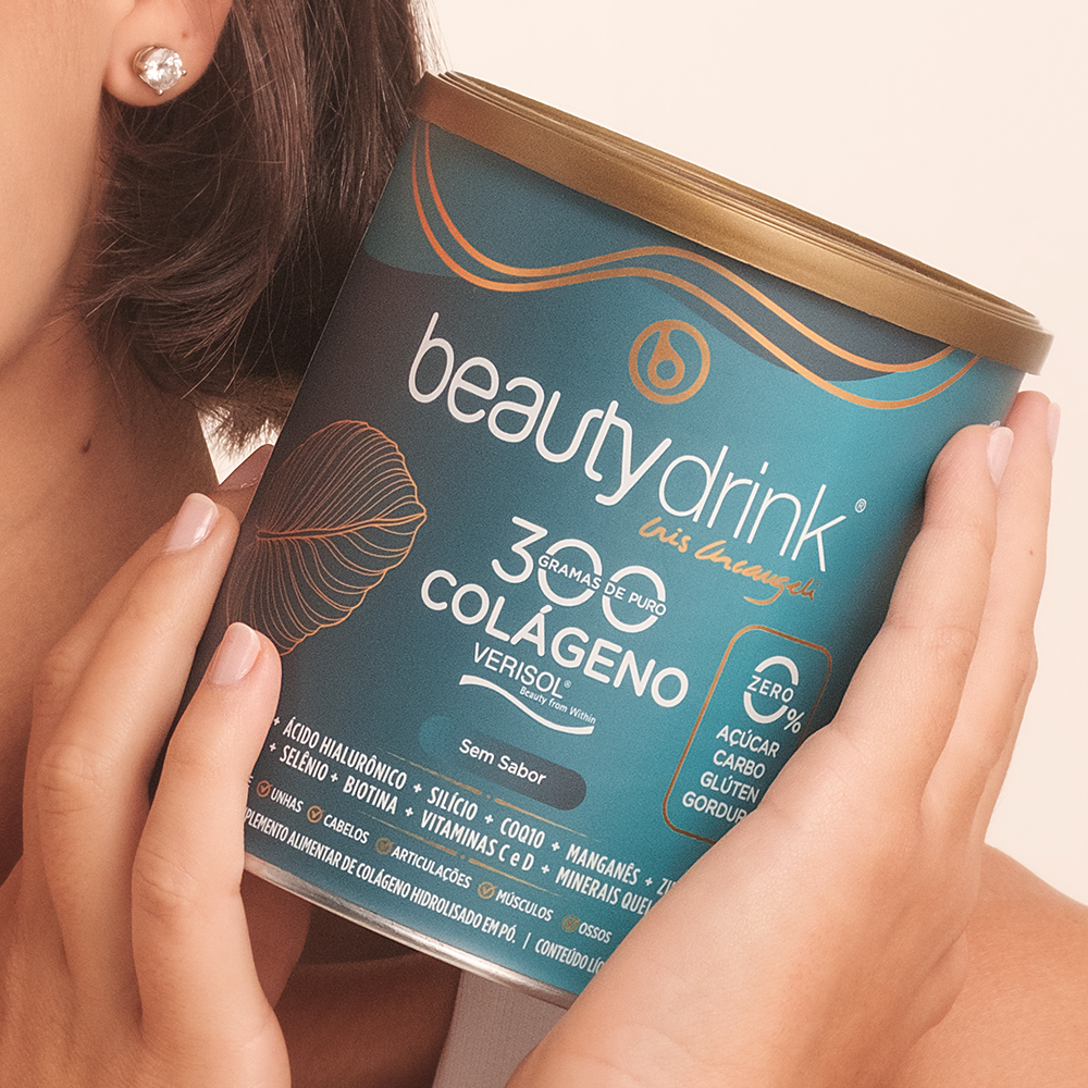
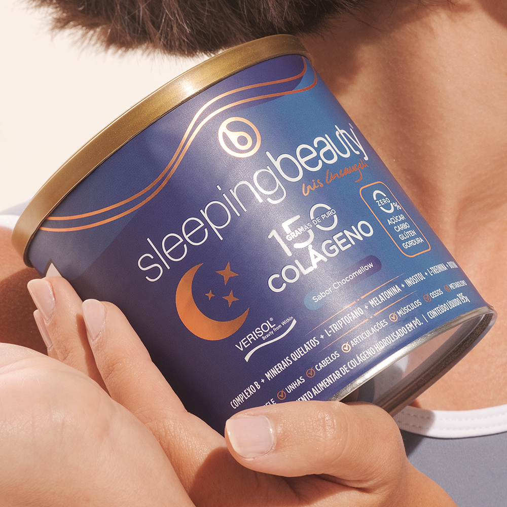
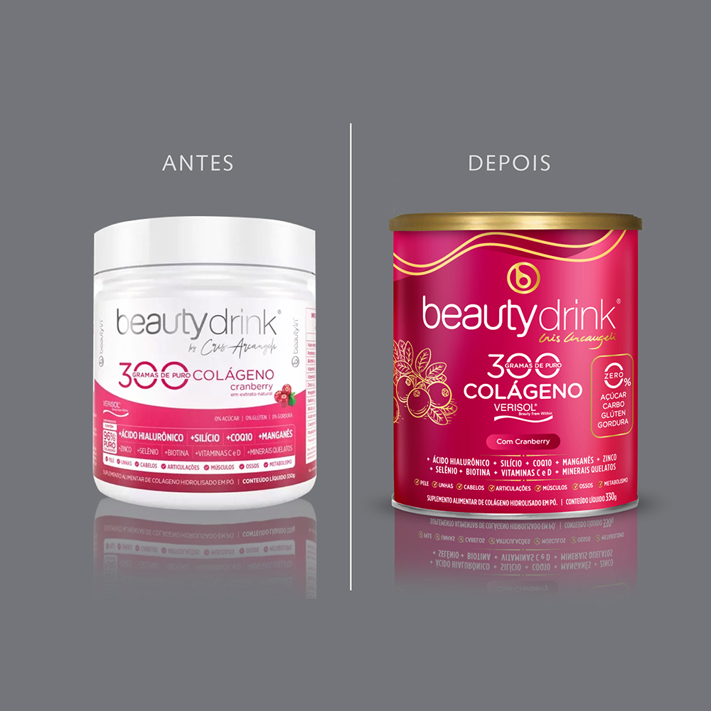
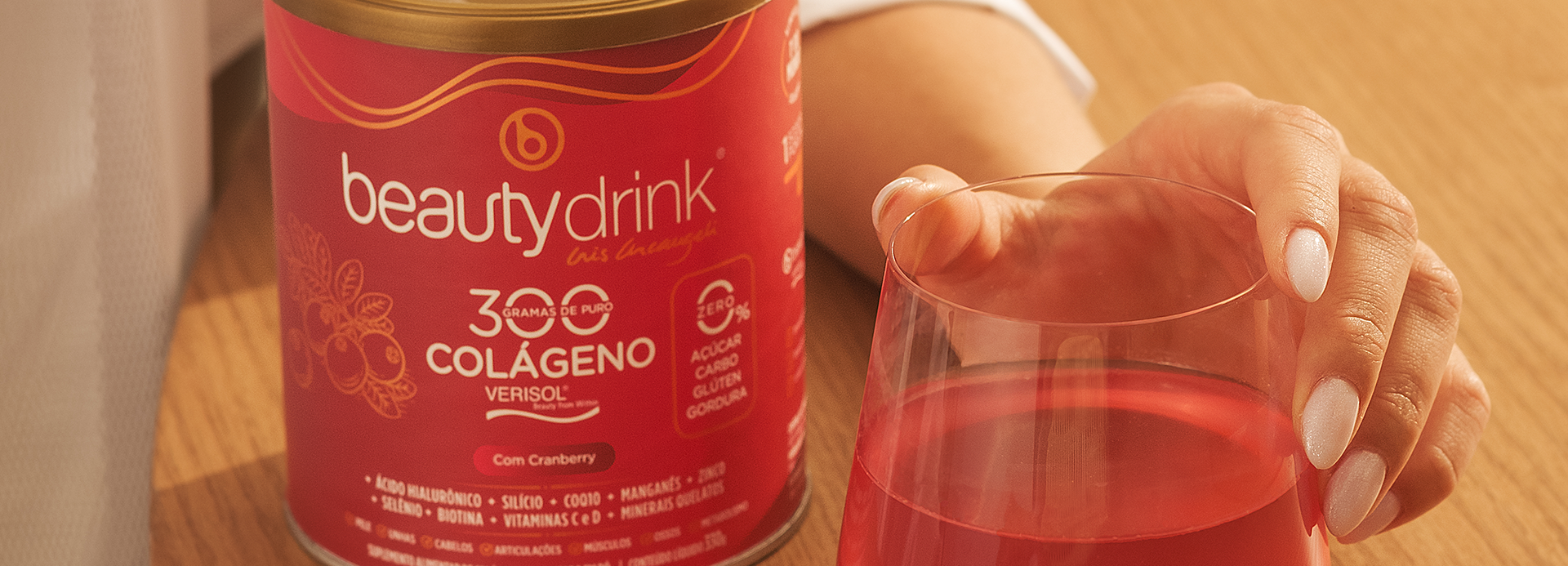
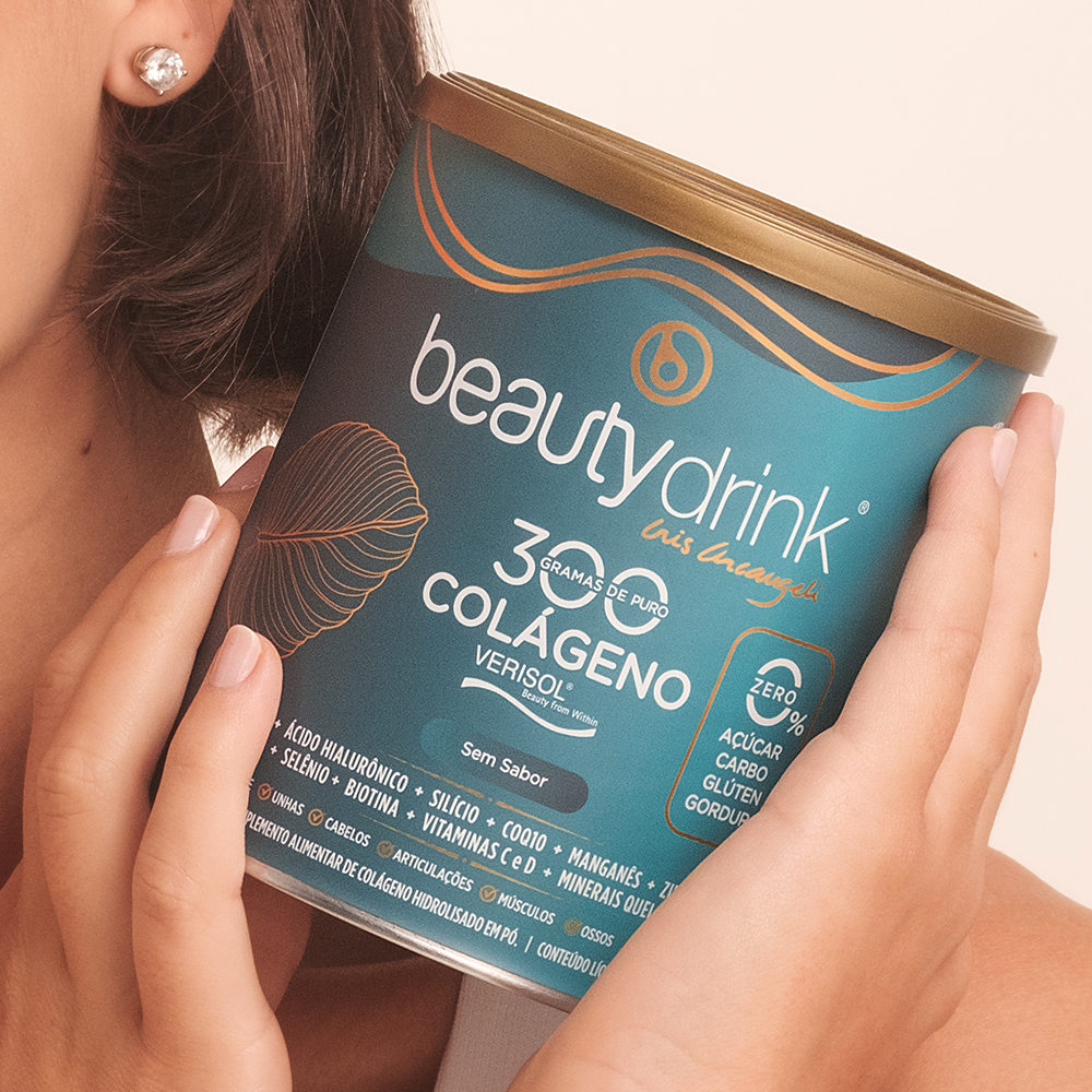
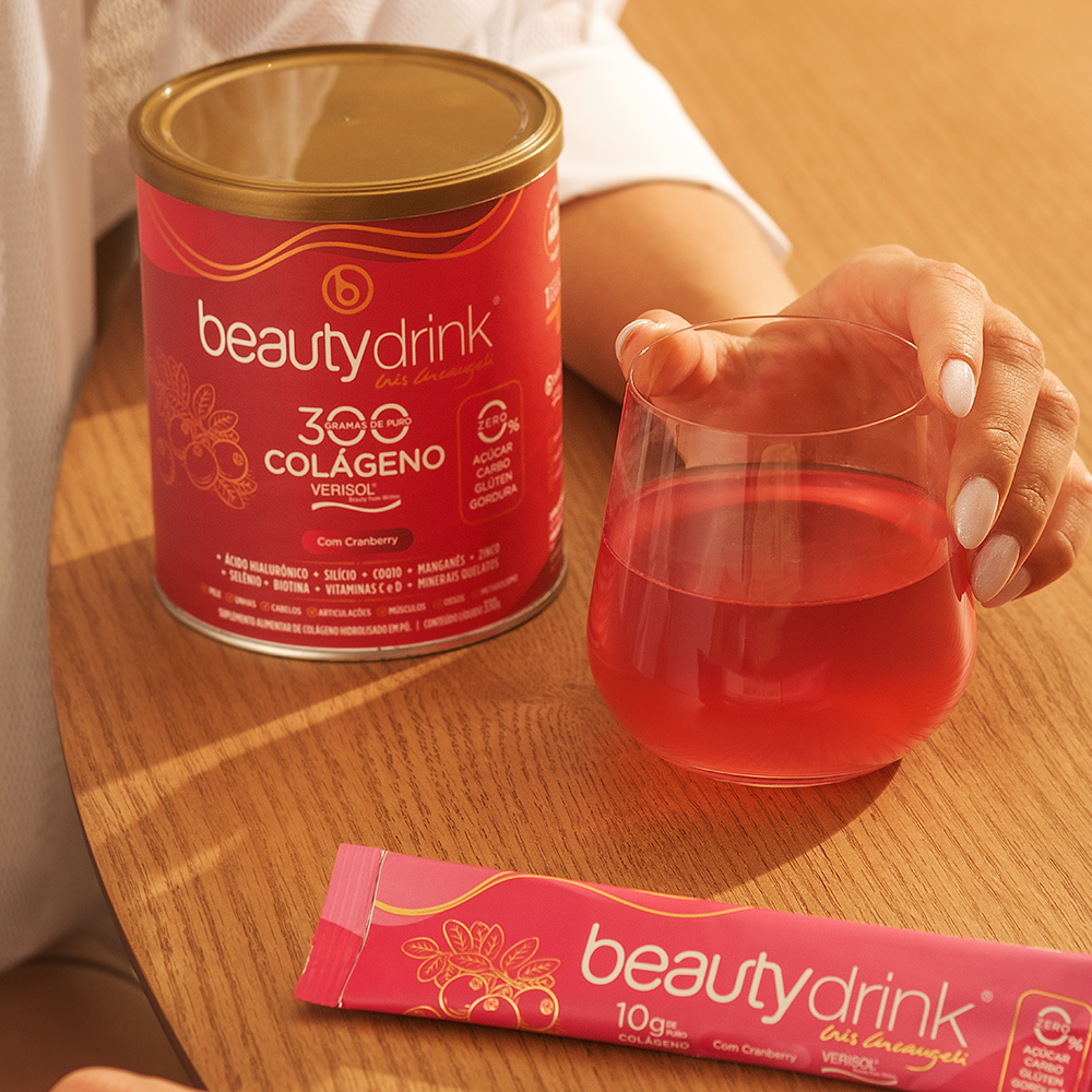
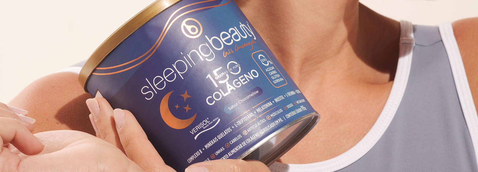
The Beauty Drink redesign elevated the brand with a more feminine, vibrant, and premium identity. Striking colors, metallic details, and a clear visual architecture transform the packaging into a highly desirable asset, strengthening its positioning and visibility at the point of sale.
The point of intersection between communication and art
beauty drink
The Beauty Drink redesign stemmed from the challenge of repositioning the brand within an increasingly competitive category, shifting the perception from a functional supplement to a desirable beauty brand. The design strategy sought to translate the world of self care through a more sophisticated, feminine, and emotional identity, without sacrificing the clarity of technical information.
The new visual language incorporates a vibrant, unique color palette for each product, paired with metallic details that elevate the perception of quality and create a striking presence at the point of sale. Delicate illustrations and organic lines reinforce femininity, lightness, and well being, while the typographic hierarchy intuitively organizes benefits, making the shopping experience faster and more engaging. Replacing plastic packaging with a premium can enhances perceived value, improves product preservation, and differentiates the brand within the category. The visual system was developed to create unity across the entire product line, allowing for easy identification of variants and strengthening brand recognition.
More than just a redesign, the project repositions Beauty Drink as an aspirational brand capable of blending science, beauty, and lifestyle into a contemporary, elegant, and memorable identity. The result is packaging that conveys confidence, sparks desire, and transforms a supplement into a true premium consumer product.