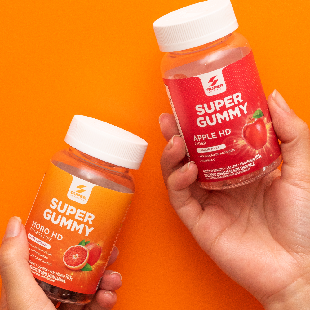
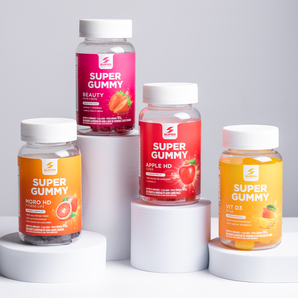
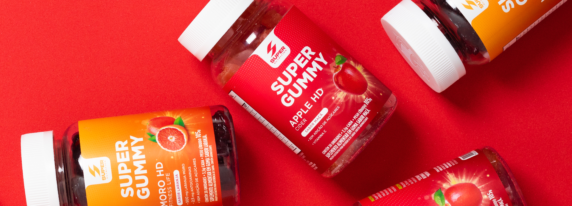
Super Gummy transforms supplementation into a fun, flavor-packed experience. Vibrant colors, prominent fruit imagery, and clear communication combine functional benefits with sensory appeal, creating a premium identity that makes daily self-care more enjoyable and desirable.
The point of intersection between communication and art
Super Gummy
Super Gummy was born from the challenge of transforming daily supplementation into a pleasurable experience, bridging the gap between functional nutrition and a sense of lightness, flavor, and fun. The project breaks away from the category’s traditional aesthetic by creating a vibrant, welcoming, and contemporary identity—one designed to spark desire and make taking vitamins and functional supplements more intuitive and enjoyable.
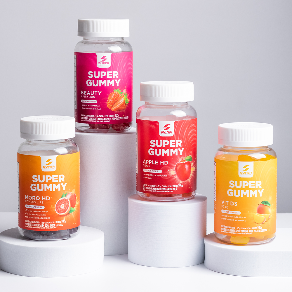
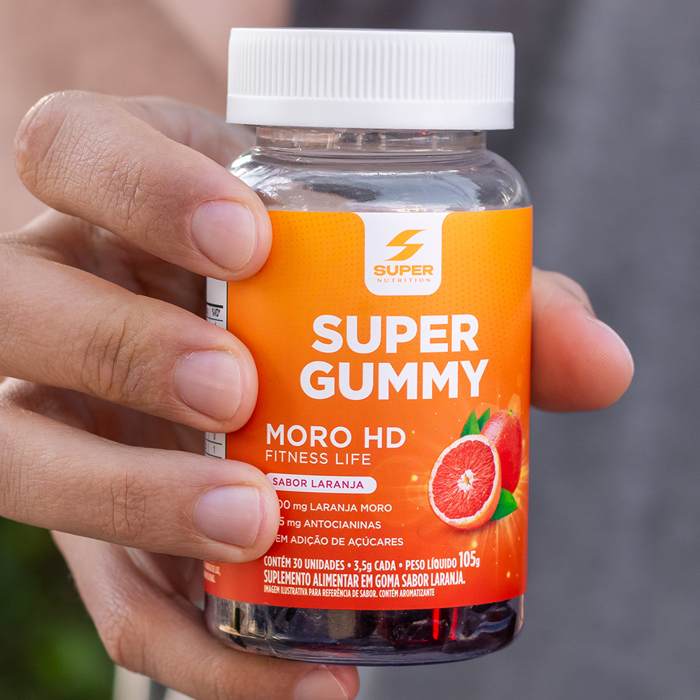
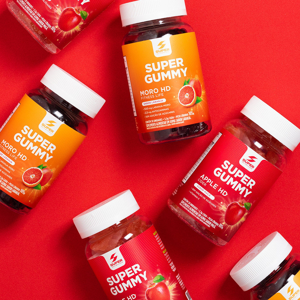
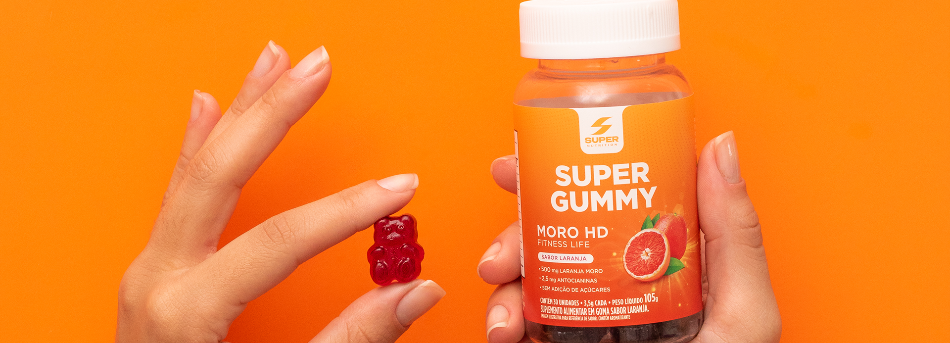
The design employs bold, unique colors for each benefit in the product line, making identification easy and strengthening the brand architecture. The logo takes center stage, conveying trust and credibility, while realistic fruit illustrations and luminous effects communicate flavor, freshness, and energy. Transparent bottles showcase the gummies themselves, reinforcing the perception of an authentic, appetizing product.
Information is organized to highlight functional benefits clearly and concisely, ensuring quick comprehension at the point of sale without sacrificing visual appeal. The identity strikes a balance between technical and emotional language, connecting science and well-being through communication that feels light and accessible.
More than just packaging, the project redefines the supplementation experience, demonstrating that taking care of one’s health can be as enjoyable as eating a treat. The result is a visually striking, premium, and memorable product line that attracts new consumers to the category and reinforces Super Gummy’s positioning as a practical, tasty, and fun way to complement one’s nutrition.