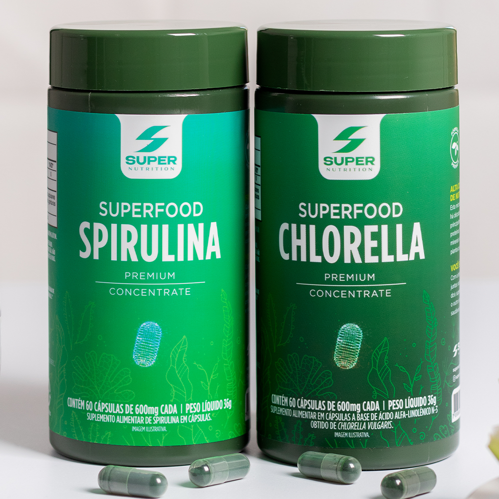
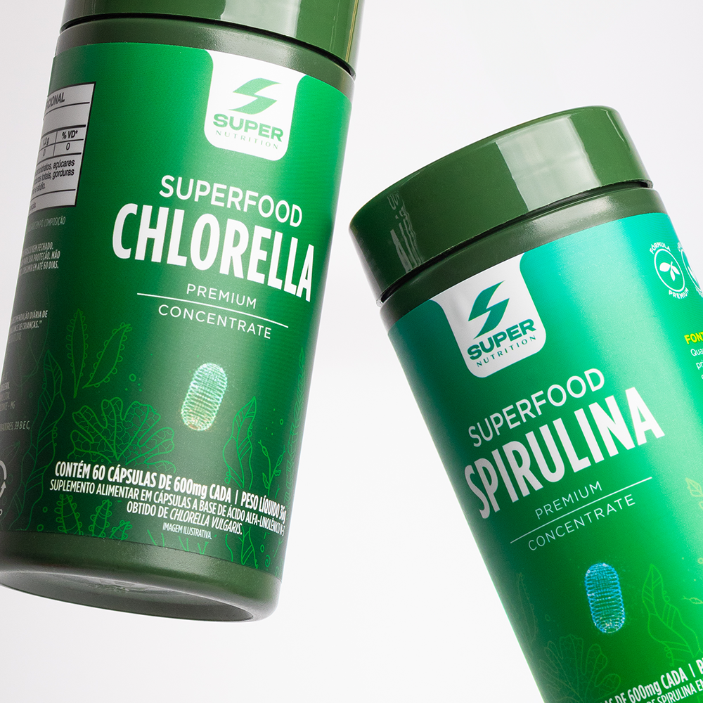
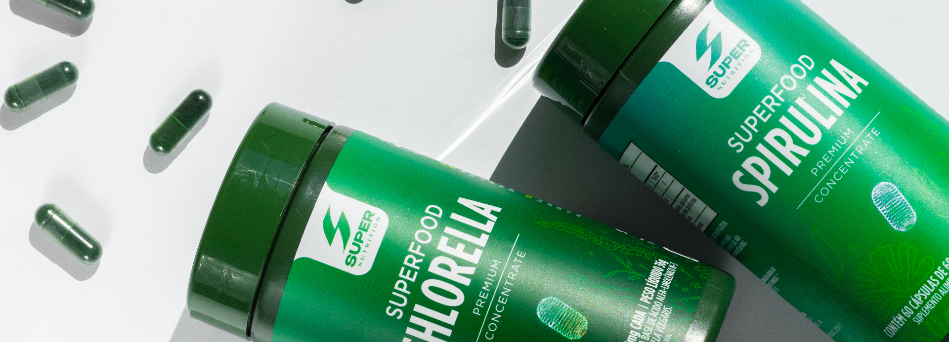
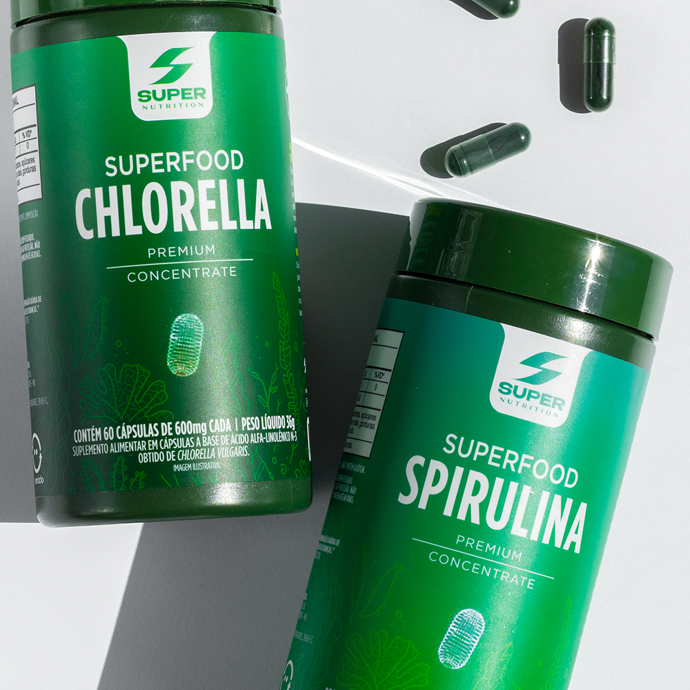
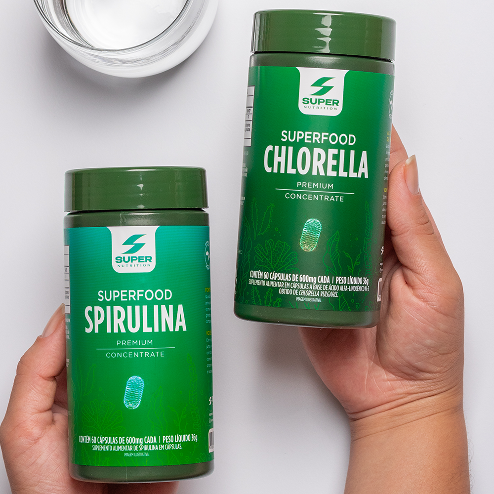
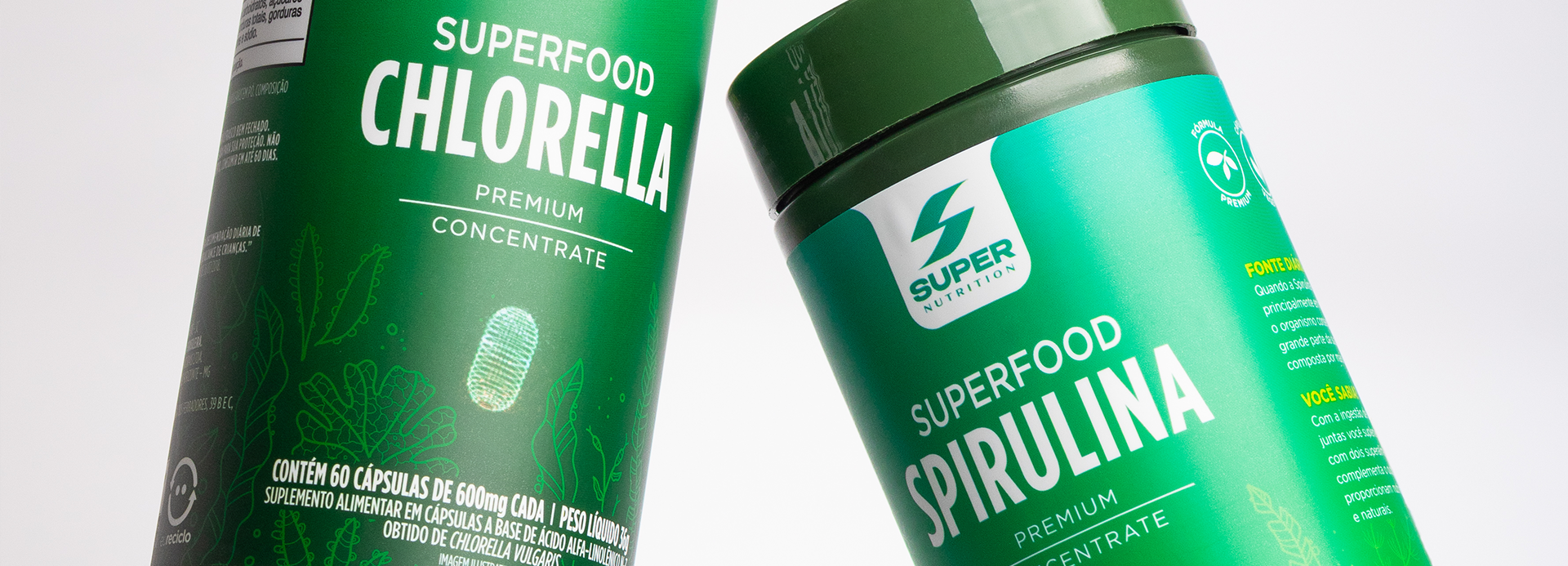
The redesign of the SUPERFOOD line combines nature, performance, and sophistication. The palette of greens, botanical illustrations, and clean visual architecture communicate purity and premium quality, strengthening brand perception and making the products stand out in the superfood segment.
The point of intersection between communication and art
SUPERFOOD Spirulina & Chlorella
The SUPERFOOD line project arose from the challenge of repositioning natural supplements as products with high perceived value, combining scientific credibility with a contemporary visual identity. The goal was to communicate purity, performance, and premium quality, making Spirulina and Chlorella more appealing to consumers seeking health solutions that are both practical and sophisticated.
The visual identity employs a palette of vibrant greens inspired by the ingredients’ natural origins, reinforcing freshness, vitality, and nutrient density. Subtly applied botanical illustrations highlight the superfoods’ origins without cluttering the visual design, while the contrast between expansive color fields and highly legible typography reinforces a sense of technology and trustworthiness.
The information architecture was designed to highlight key product attributes quickly and clearly, facilitating readability at the point of sale and instilling consumer confidence. The graphic system creates a cohesive link between the line’s various ingredients, enabling easy identification of each version and strengthening brand recognition.
More than just an aesthetic update, the project transforms natural supplements into a premium, contemporary, and high performance product line. The result is packaging that communicates a balance between nature and science, elevates the brand’s perceived value, and positions SUPER Nutrition as a benchmark in the superfood segment.