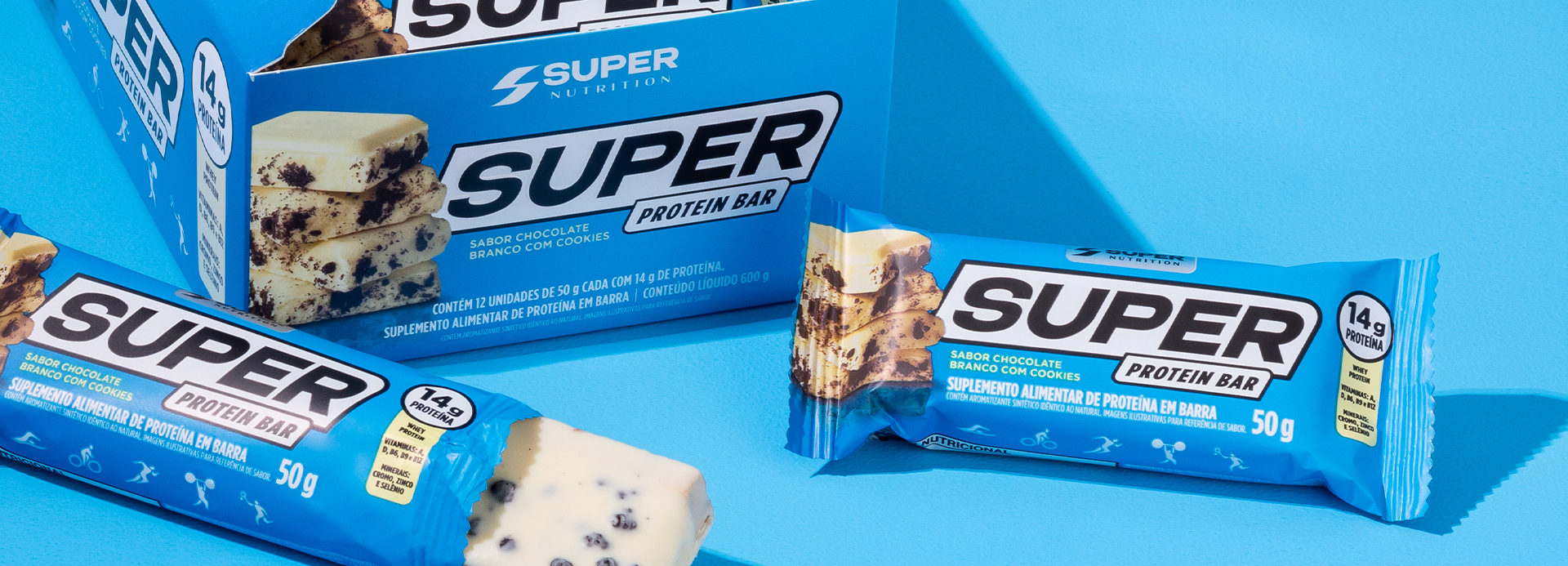
The SUPER Protein Bar combines performance and indulgence within a premium identity. Vibrant colors, strong brand prominence, striking appetite appeal, and a clear visual architecture highlight nutritional benefits, elevating the perception of quality and impact at the point of sale.
The point of intersection between communication and art
SUPER Protein Bar
The SUPER Protein Bar project stemmed from the challenge of transforming a protein bar into a highly desirable product, combining the brand’s nutritional credibility with the sensory experience of a premium snack. The design breaks away from the category’s traditional aesthetic by balancing performance oriented messaging with a strong appeal to indulgence, bridging the gap between the sports world and the pleasure of enjoying a treat.
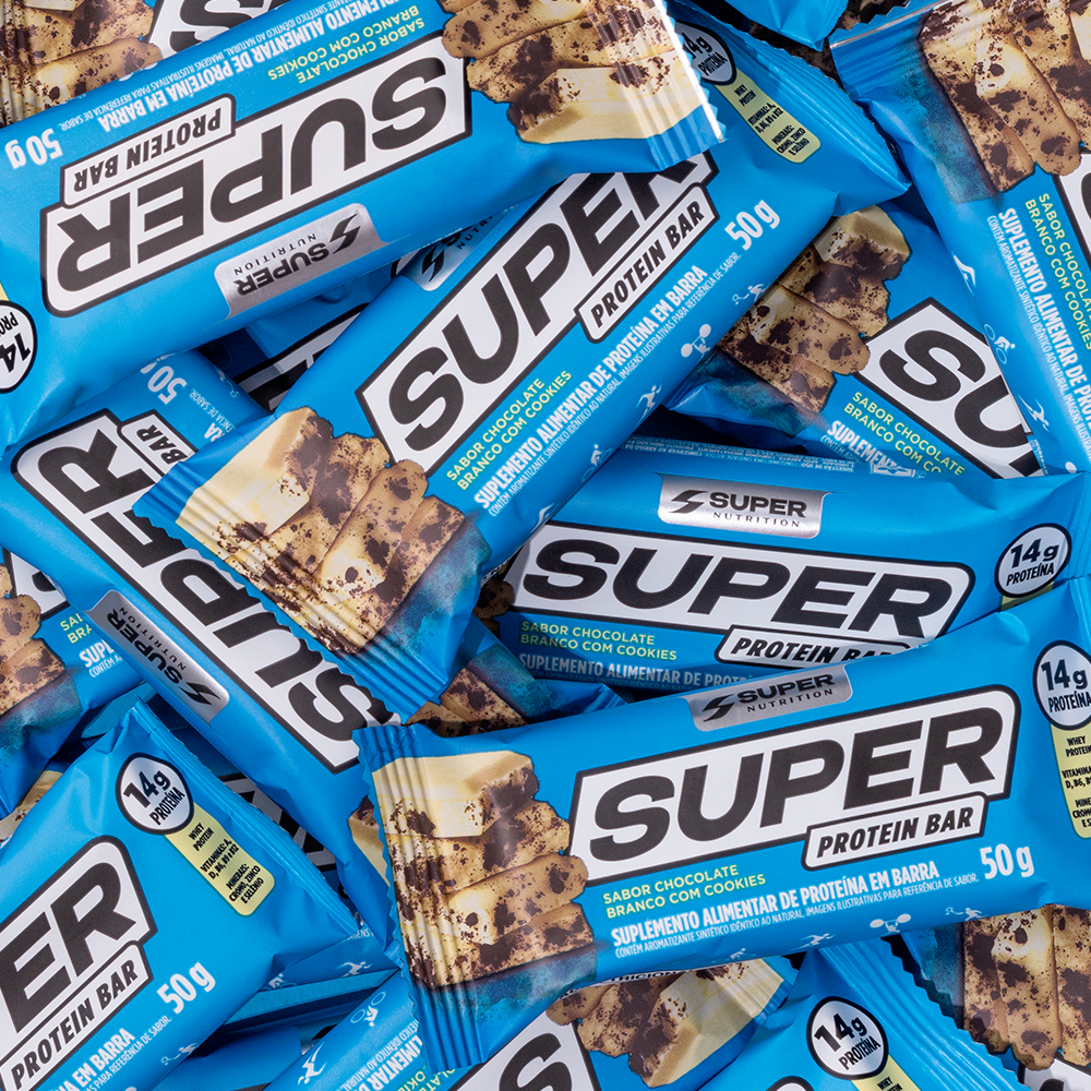
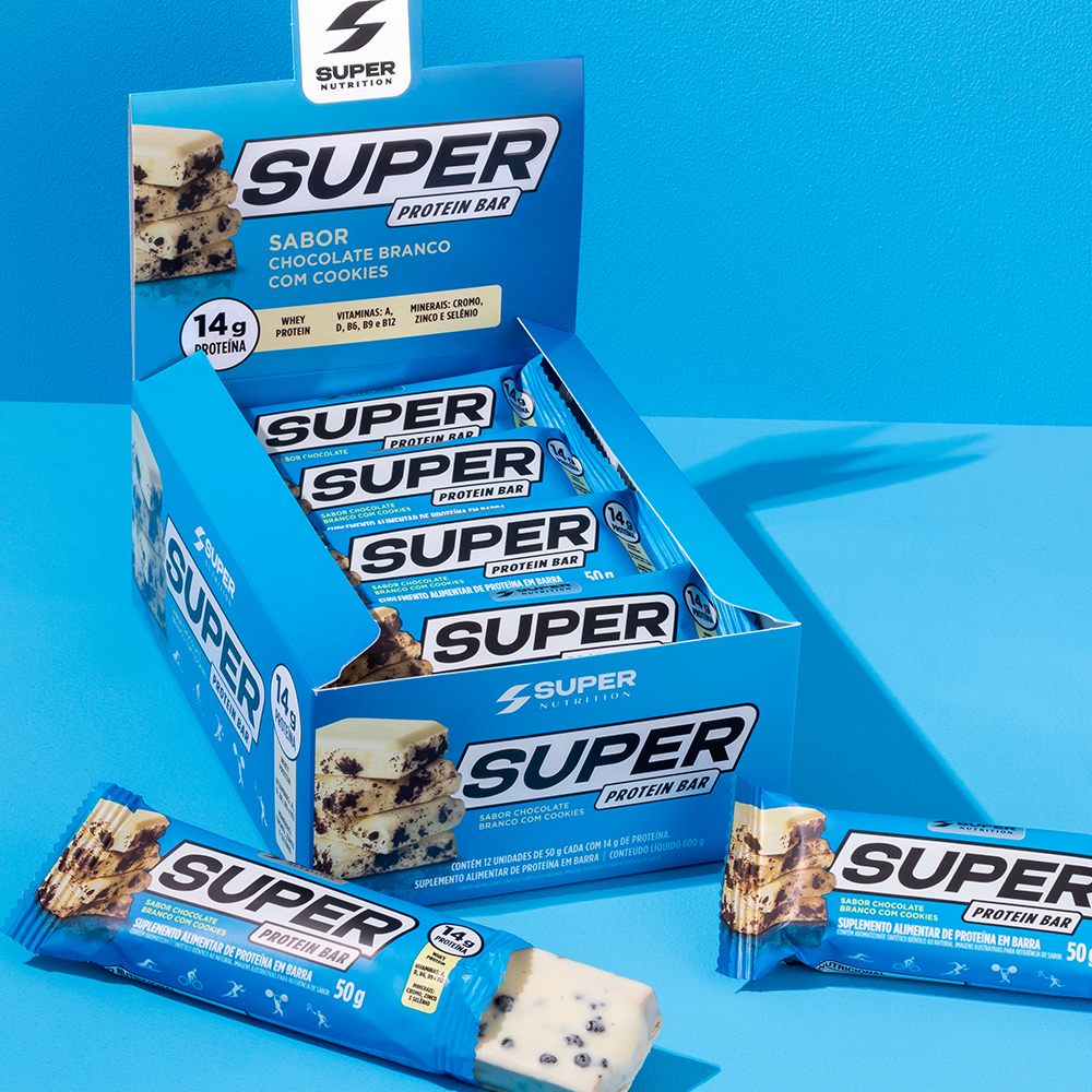
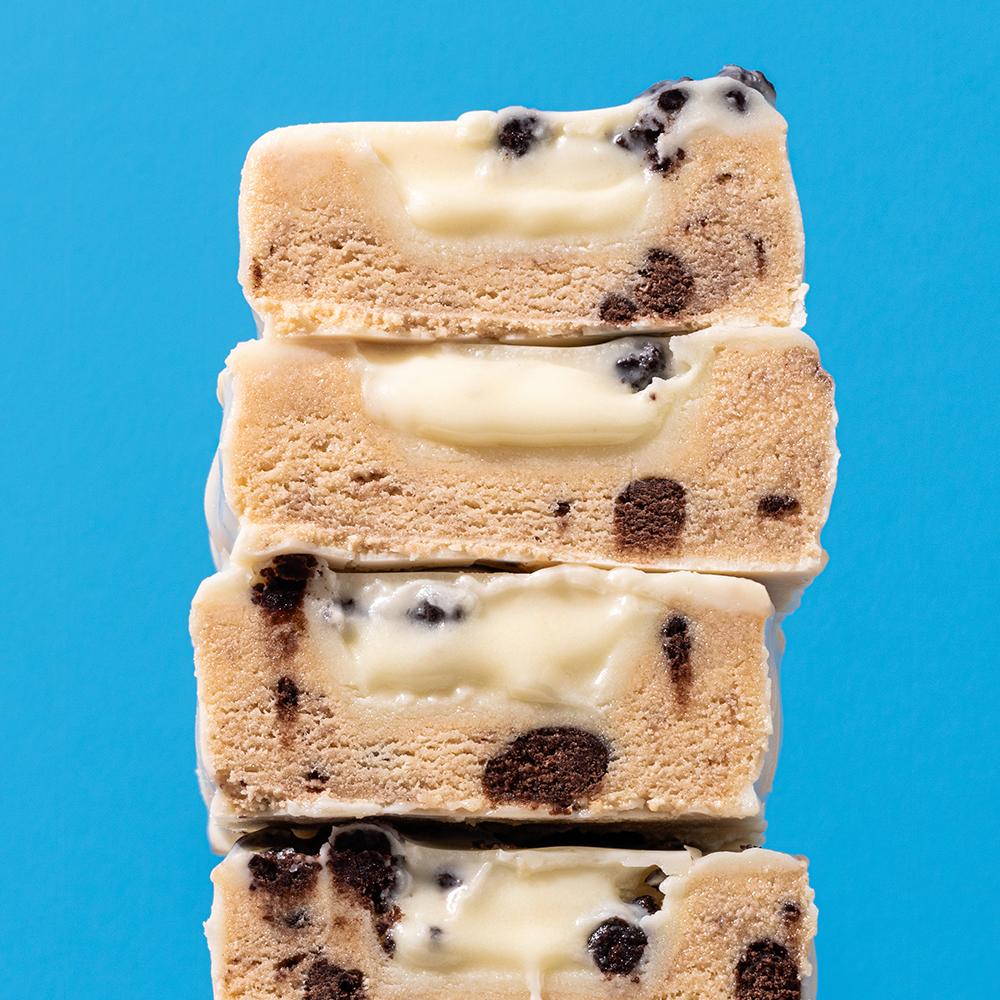
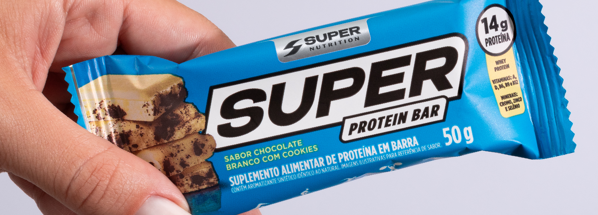
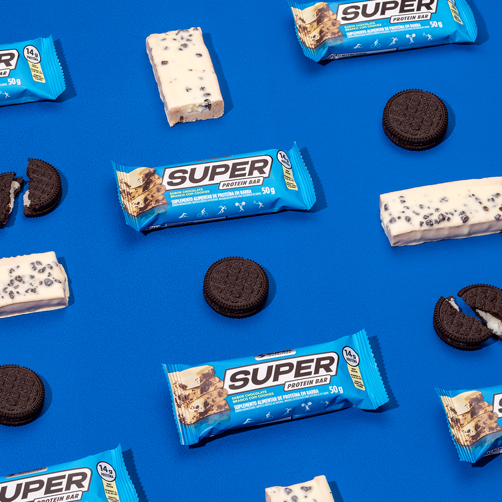
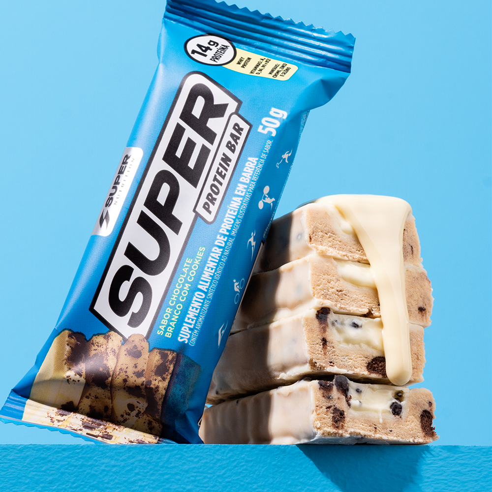
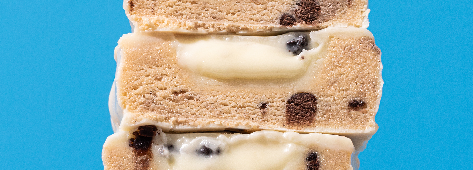
The visual identity employs a vibrant, high contrast palette to ensure maximum visibility at the point of sale. The logo takes center stage, reinforcing the brand’s strength and recognition, while product photography highlights texture, creaminess, and the filling, sparking the desire to consume. The visual appeal was crafted to communicate flavor instantly, making the emotional benefit just as significant as the functional one.
The information architecture prioritizes key nutritional attributes, organized clearly and intuitively to facilitate quick reading and purchasing decisions. The graphic system distinguishes between flavors without compromising the line’s visual unity, strengthening the product family’s identity and enhancing its shelf presence.
More than just packaging, the project creates a visual experience that connects performance, flavor, and premium quality. The result is a contemporary, impactful, and memorable identity capable of elevating the perceived value of the SUPER Protein Bar and repositioning the protein bar category through a more indulgent and aspirational lens.