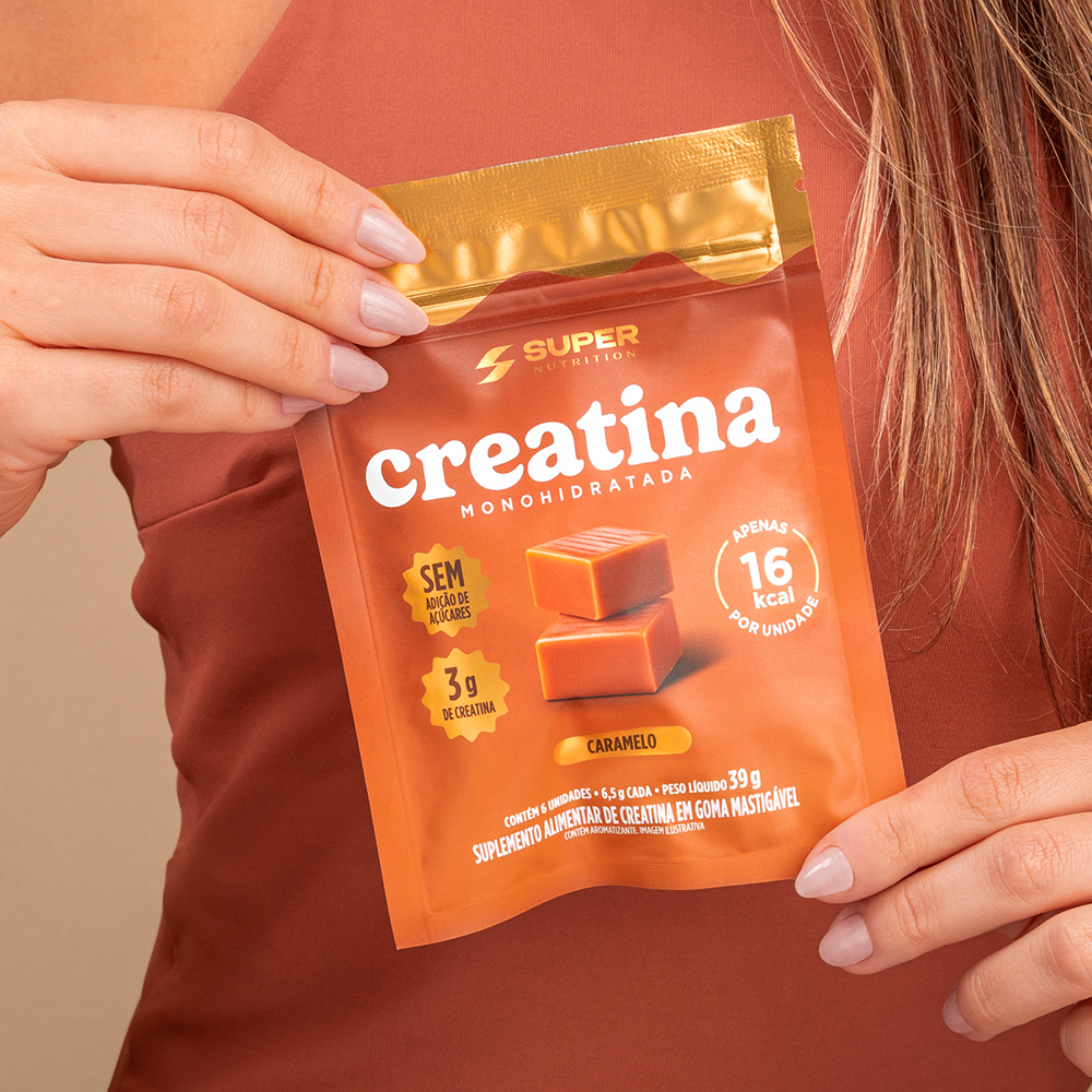
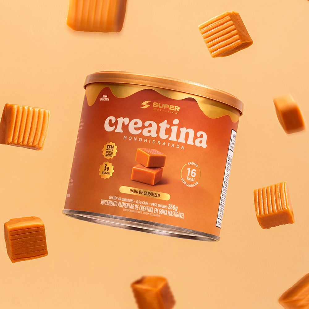
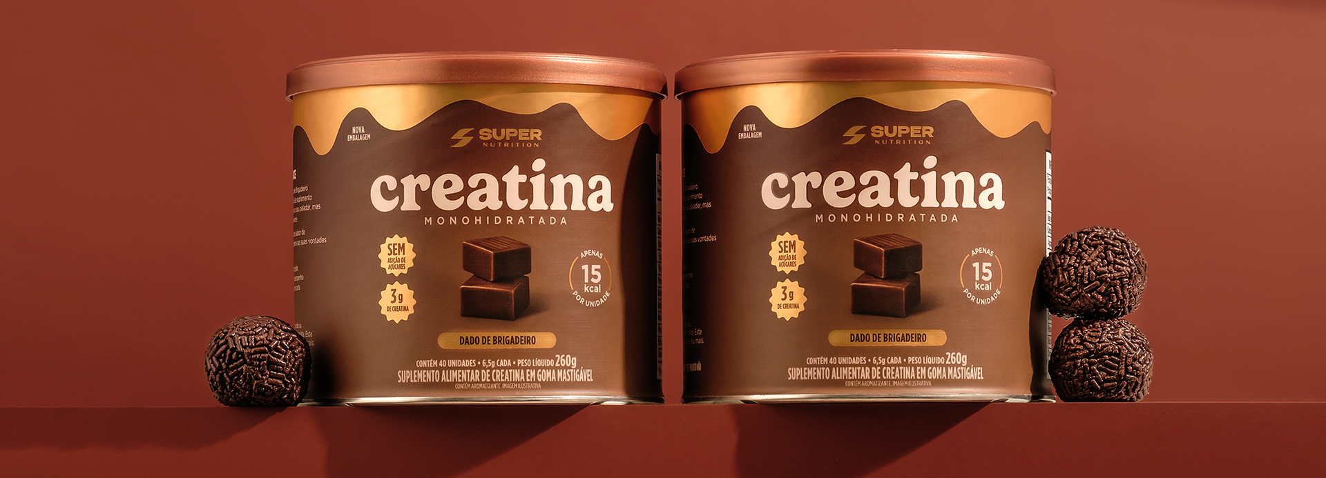
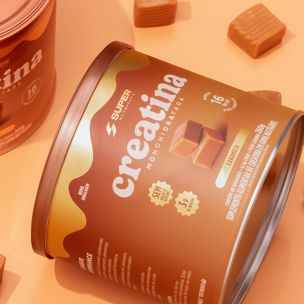
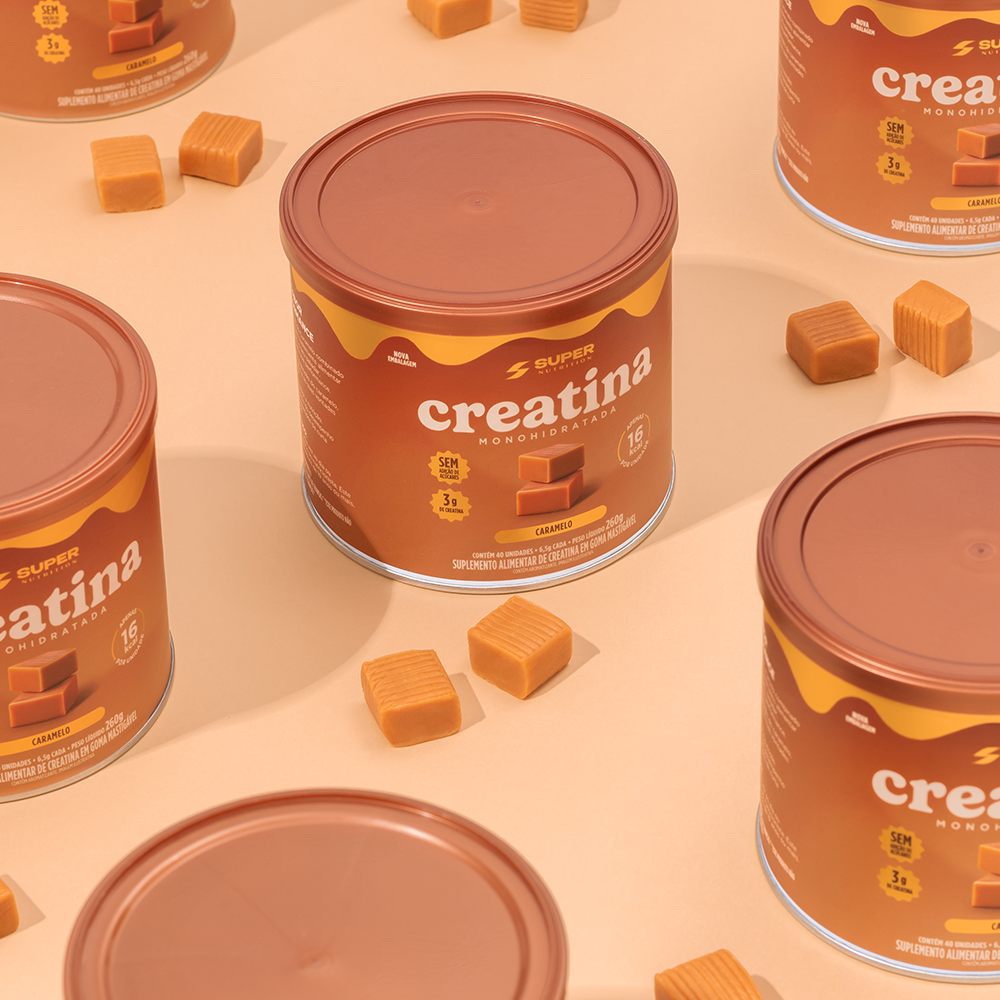
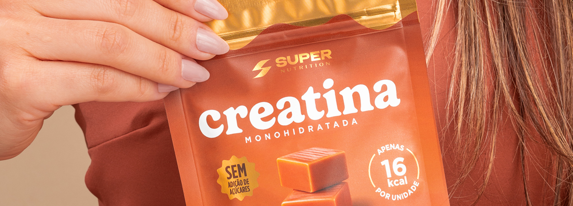
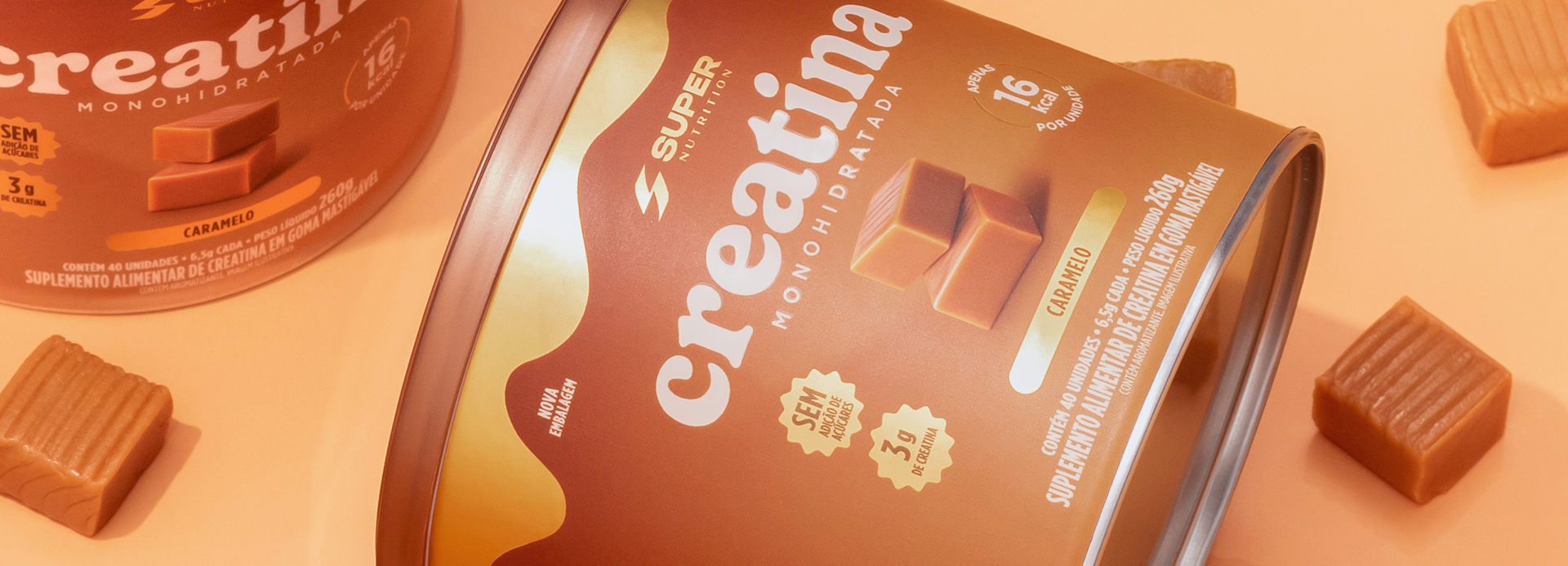
The design breaks the mold for supplements by combining performance and indulgence. Inspired by the world of caramels, it employs warm colors, premium details, and strong sensory appeal to transform the creatine into a product that is desirable, sophisticated, and striking at the point of sale.
The point of intersection between communication and art
caramelo de creatina
The project stemmed from the challenge of breaking away from the traditional visual language of the supplement category—typically technical and functional—to create packaging capable of sparking desire even before the first use. Inspired by the indulgence of artisanal caramels, the design bridges the worlds of performance and pleasure, transforming creatine into an aspirational product.
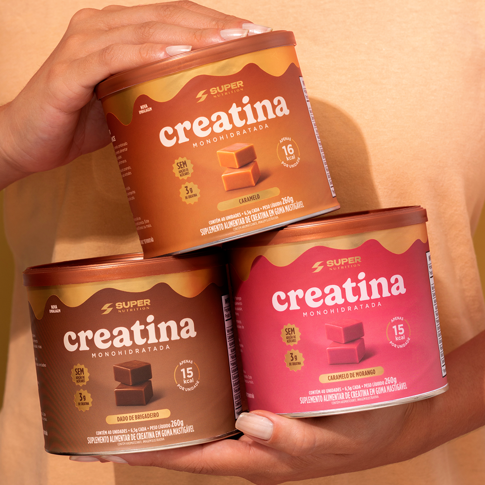
The visual identity employs a warm, sophisticated palette, combining caramel, chocolate, and gold tones to convey flavor, premium quality, and indulgence. A “sauce” graphic element at the top of the package immediately reinforces the sensory appeal, while product photography highlights texture and creaminess, further enhancing visual allure.
The information architecture was streamlined to highlight key benefits quickly and intuitively, balancing nutritional communication with an emotional aesthetic. Each flavor features a unique color, strengthening product differentiation within the line while maintaining visual cohesion and brand recognition.
More than just launching a supplement, the project introduces a new perception of the category: a product that unites performance, pleasure, and design. The result is striking, contemporary, premium packaging that transforms a functional benefit into a desirable consumer experience, elevating the brand’s perceived value and creating a strong impact at the point of sale.