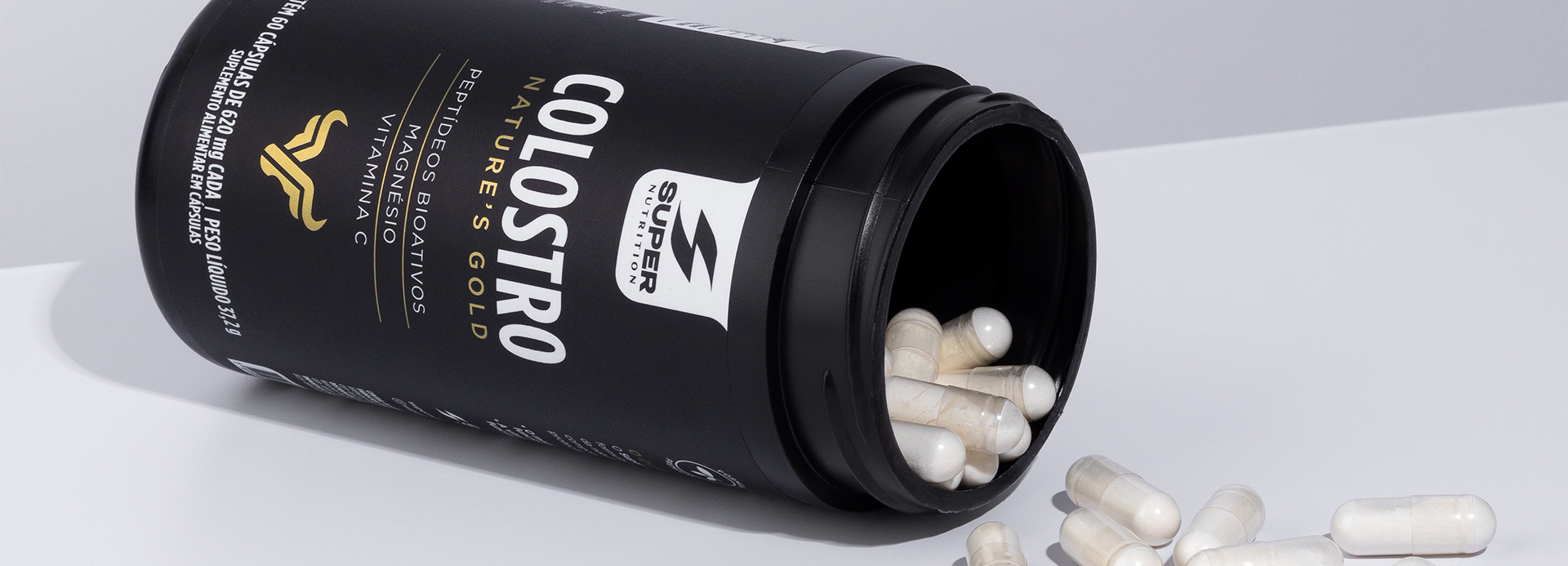
The design transforms a technical ingredient into a premium experience. With a minimalist aesthetic, matte black finish, and gold accents, the packaging conveys science, purity, and trust, highlighting the benefits of colostrum and reinforcing Super Nutrition’s positioning.
The point of intersection between communication and art
Colostro
The challenge of this project was to translate an ingredient of high scientific complexity into a brand perceived as premium, accessible, and trustworthy. Bovine colostrum is recognized for its bioactive peptides and nutritional benefits, yet communication within the category tends to be overly technical. The design was developed to simplify this message without sacrificing credibility.
The visual identity combines matte black with gold accents to convey excellence, purity, and high value. The graphic layout prioritizes information clarity, highlighting key product assets and creating an experience that is straightforward, elegant, and intuitive. A symbol inspired by strength and vitality reinforces the colostrum’s natural origins and conveys potency in a sophisticated manner.
The result is contemporary packaging that sets the product apart in the supplement market, strengthens the Super Nutrition brand’s authority, and transforms a highly technical ingredient into a premium visual experience—instilling confidence even before the product is consumed.