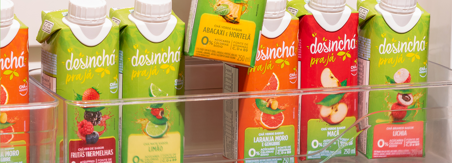
Desinchá Pra Já translates practicality and freshness into a vibrant, contemporary identity. Bright colors, highlighted ingredients, and clear communication reinforce naturalness, convenience, and well being, elevating the brand’s perception and its impact at the point of sale.
The point of intersection between communication and art
Desinchá Pra Já
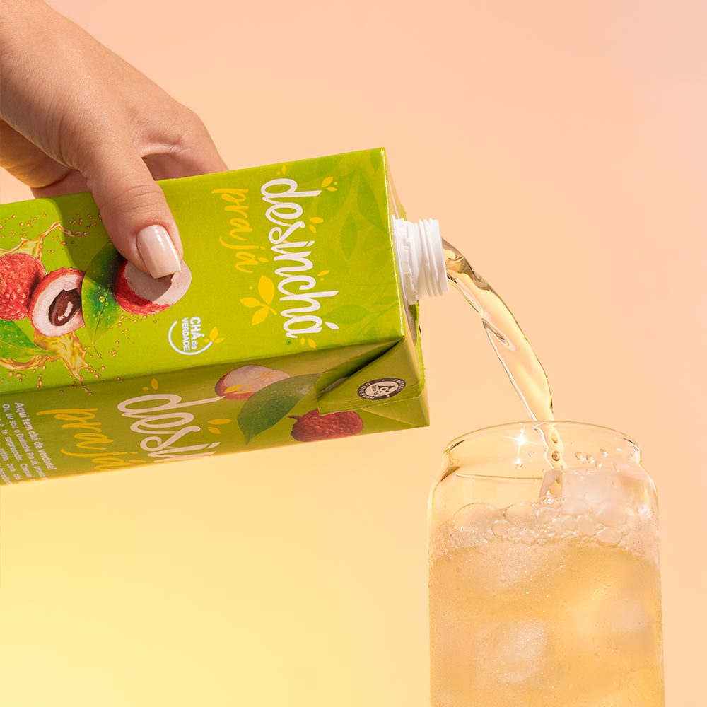
Desinchá Pra Já was born from the challenge of translating the brand’s essence into a ready to drink format, offering convenience without sacrificing the perception of naturalness and well being. The project aimed to create packaging that conveyed freshness, lightness, and convenience, making the product highly appealing for immediate consumption.
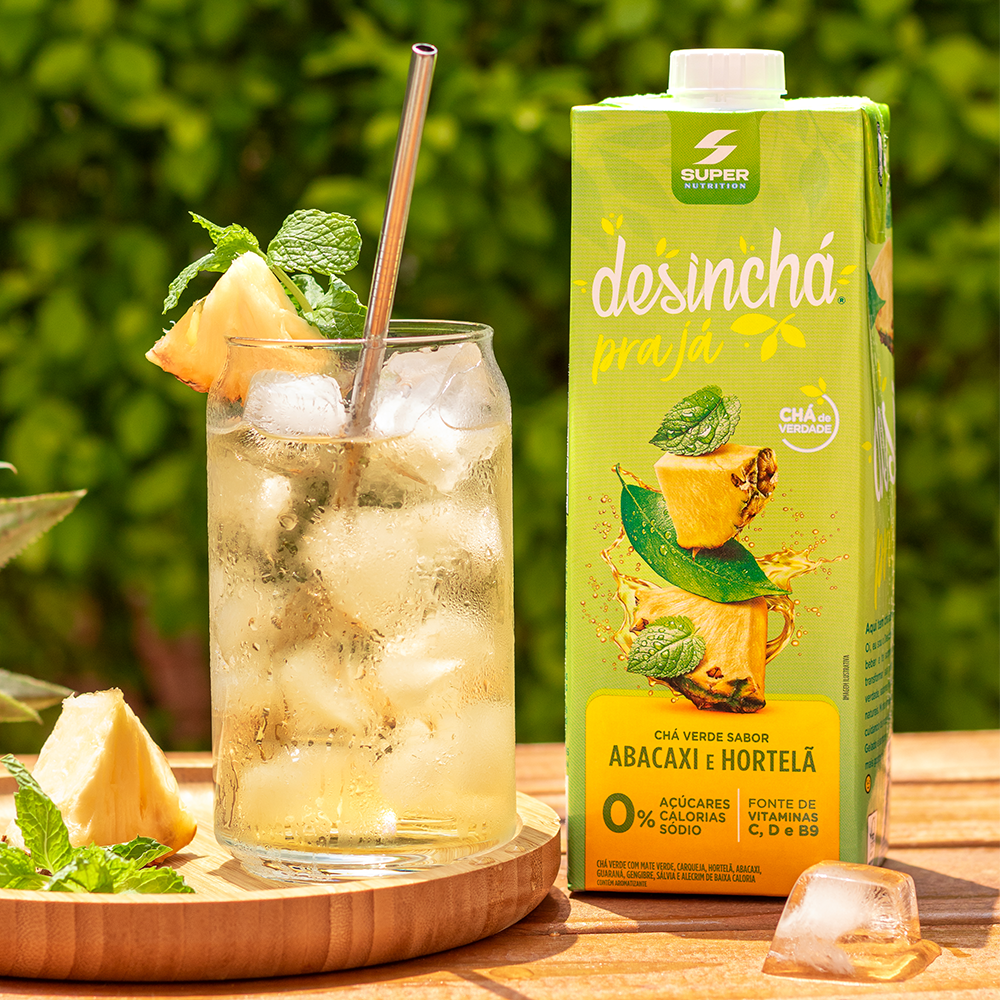
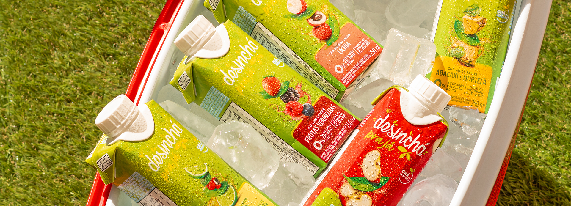
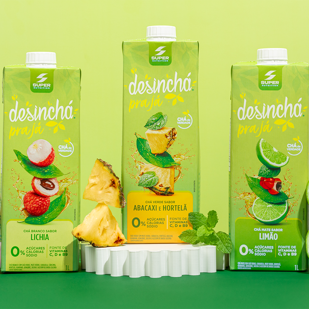
The visual identity preserves Desinchá’s core brand assets while evolving its visual language into a more vibrant and contemporary realm. A palette of luminous greens communicates naturalness and refreshment, while flavor specific accent colors facilitate product identification and boost shelf impact. Illustrations of ingredients integrated with fluid motion and botanical elements reinforce the drink’s natural origins and instantly create visual appeal.
The information architecture was streamlined to highlight key product benefits such as zero sugar, low calorie count, and added vitamins allowing for quick, clear communication in a fast paced retail environment. The logo takes center stage to reinforce brand recognition, creating visual unity across the entire product line.
More than just packaging, the project transforms the ready to drink tea concept into a light, modern, and desirable visual experience. The result is an identity that communicates freshness, functionality, and convenience, strengthening Desinchá’s position as a benchmark in natural beverages and increasing its relevance in an increasingly competitive category.