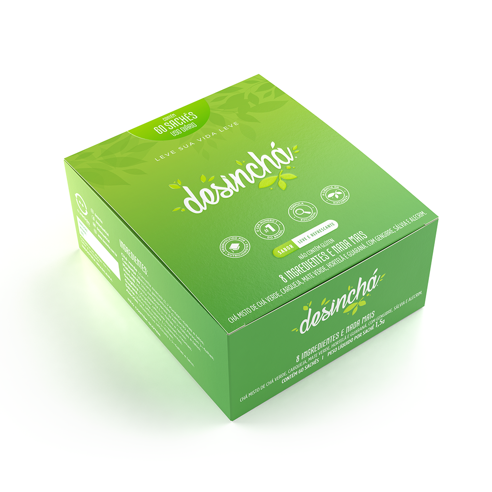
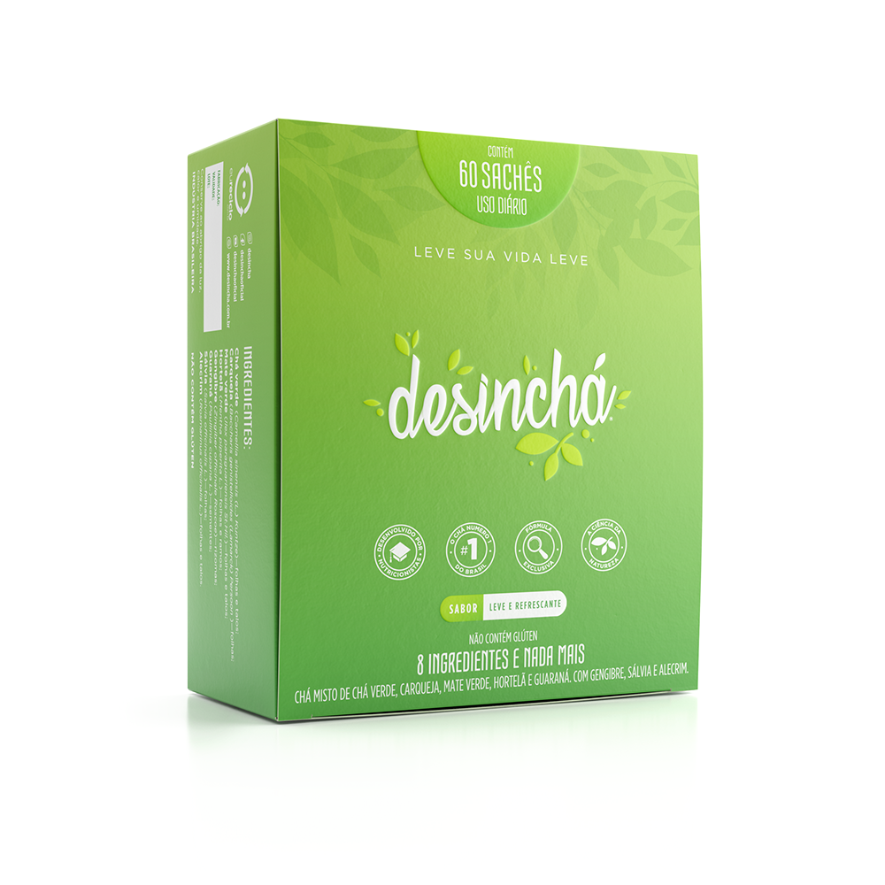
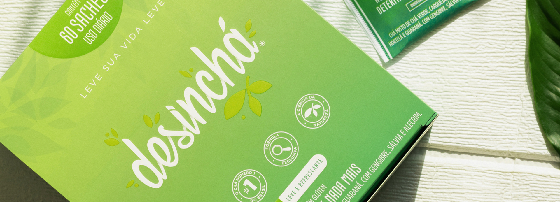
Desinchá pioneered a new category of functional teas with a comprehensive branding and packaging project. The identity conveys naturalness, lightness, and credibility, establishing distinctive visual cues that strengthened the brand, differentiated the product, and drove its market leadership.
The point of intersection between communication and art
desinchá
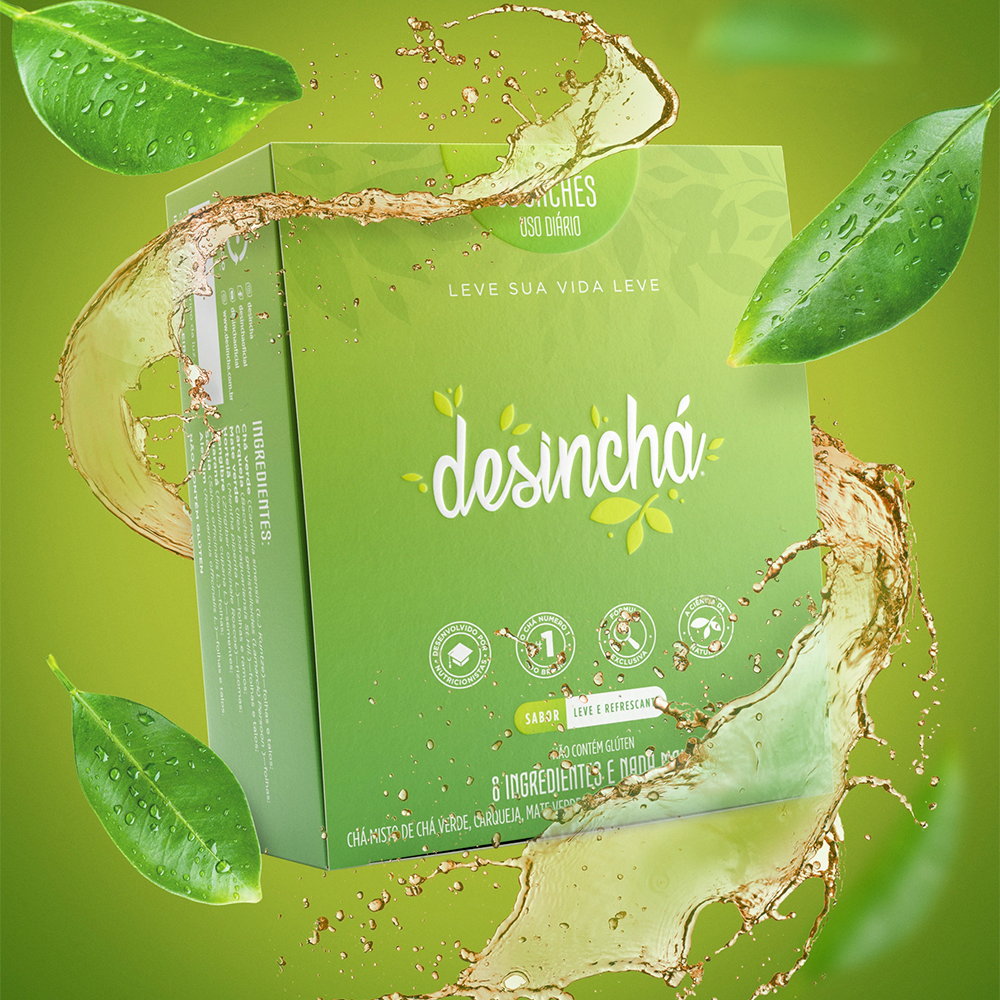
The Desinchá project was born with a mission that went far beyond mere packaging: to build a brand identity that would launch an entirely new category in the Brazilian market. As a pioneer in the functional daily-use tea segment, Desinchá needed to convey naturalness, credibility, and desirability using a language that was simple, memorable, and highly recognizable.
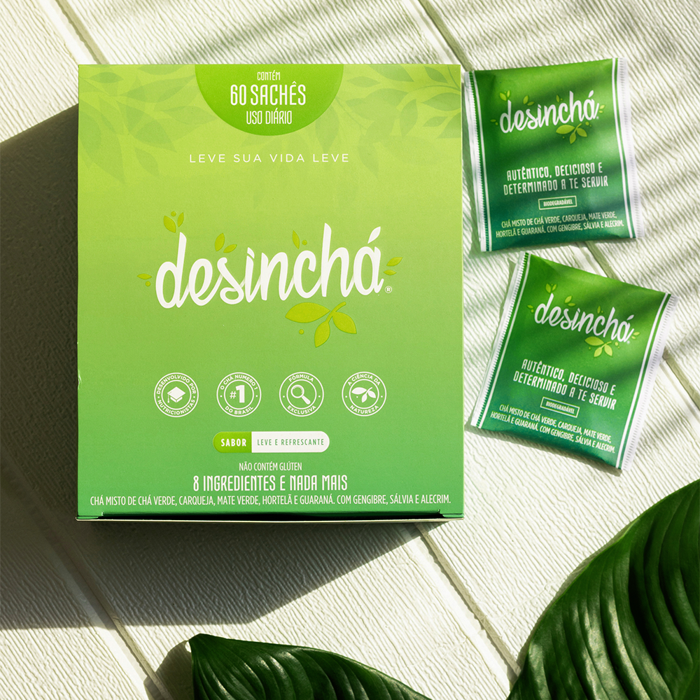
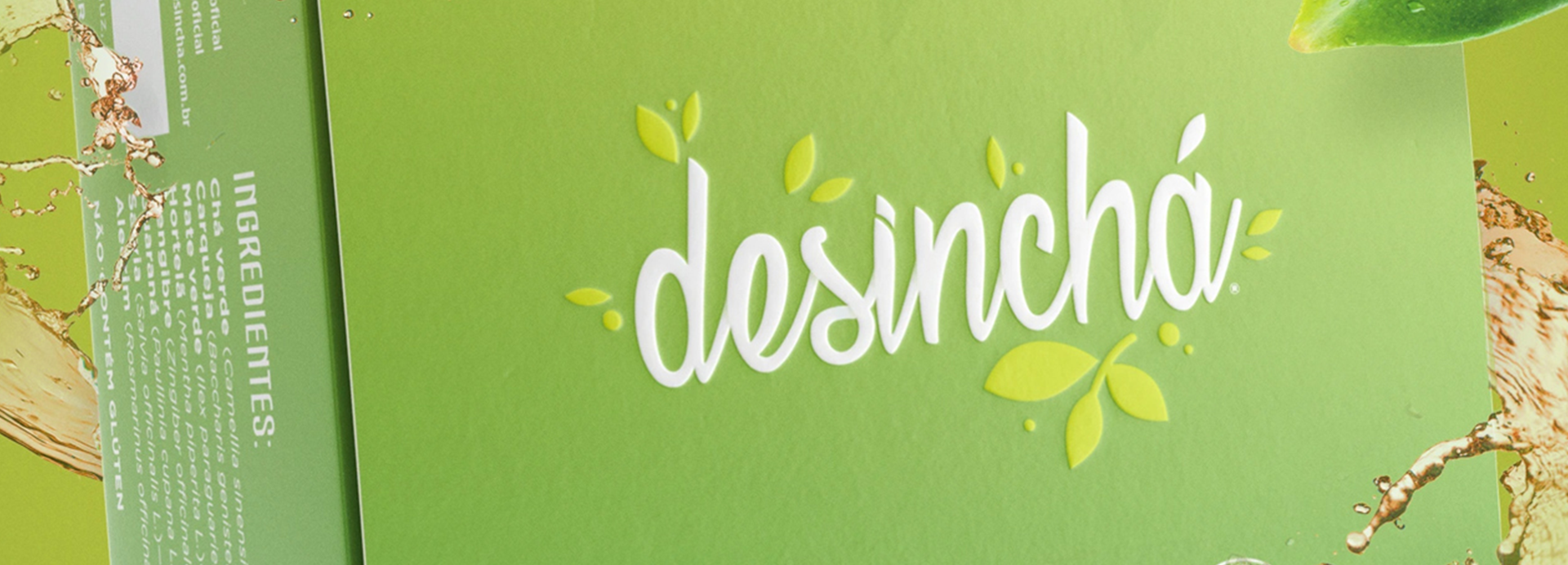
We developed the complete branding strategy, visual identity, and packaging architecture, transforming a functional product into a brand with a distinct personality. Green became a key visual asset for the category, representing freshness, lightness, and the natural origin of the ingredients. The organic logo, inspired by leaves, reinforces a sense of approachability and well-being, while the minimalist composition prioritizes information clarity and makes key benefits easy to identify.
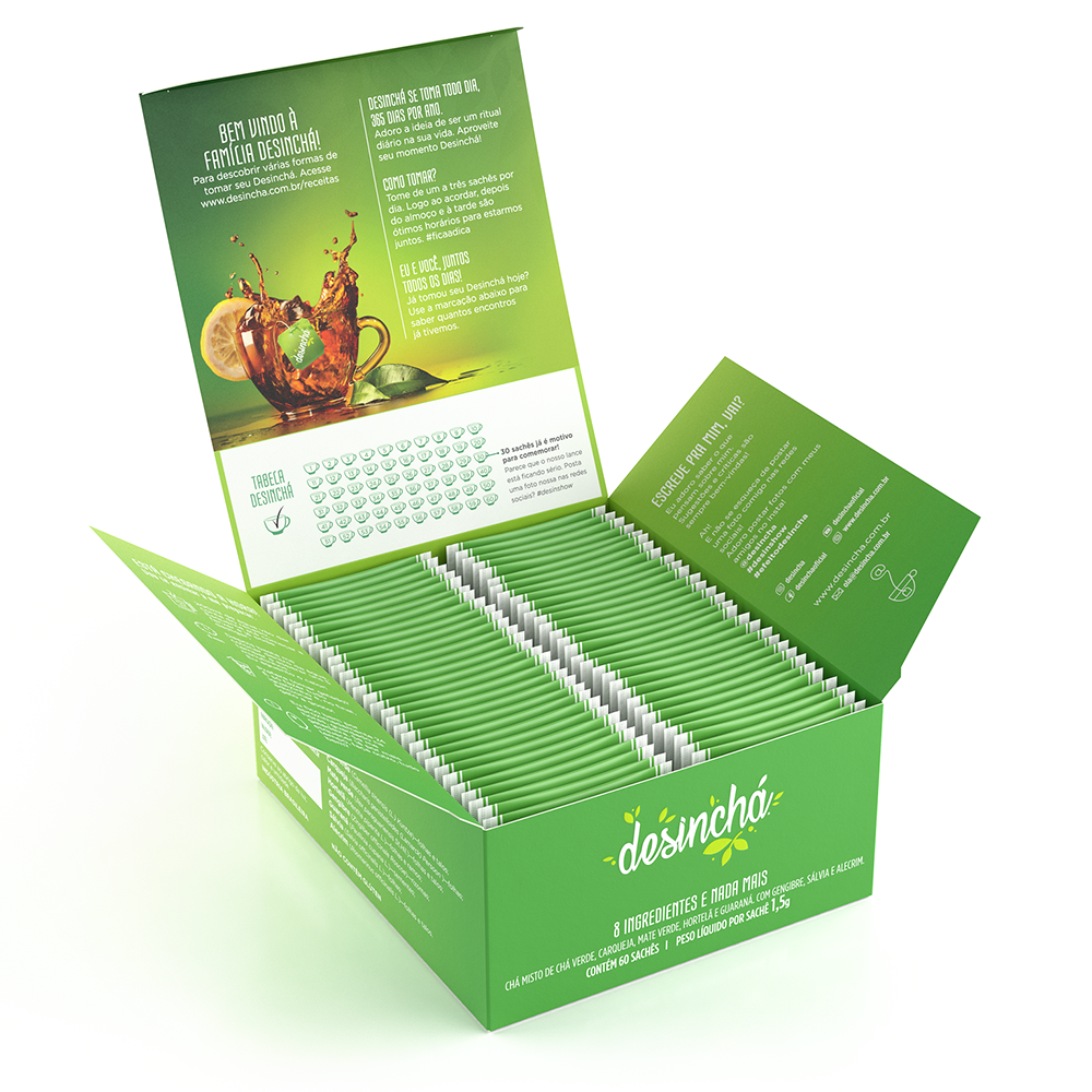
The packaging was designed to accompany the consumer throughout their entire usage journey. The box organizes the tea bags practically, incorporates encouraging messages, and fosters an ongoing relationship with the brand, turning a simple daily ritual into a pleasurable habit. More than just protecting the product, the packaging communicates purpose, educates, and strengthens the emotional bond with the consumer.
The result was the establishment of a unique identity capable of launching a new category, standing out in a market that lacked existing benchmarks, and setting the visual codes now recognized and associated with the world of functional teas. It is a project where branding, graphic design, and user experience converge to turn innovation into market leadership.