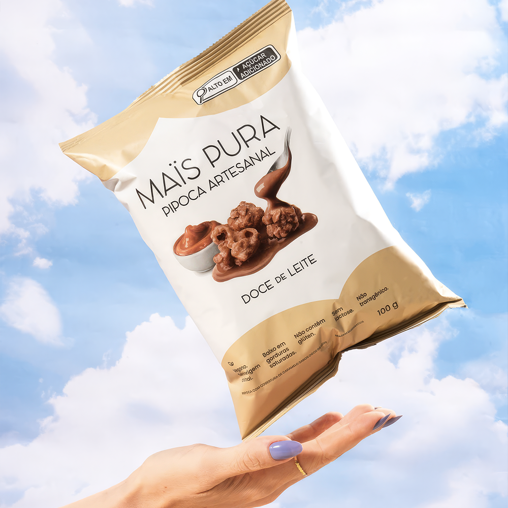
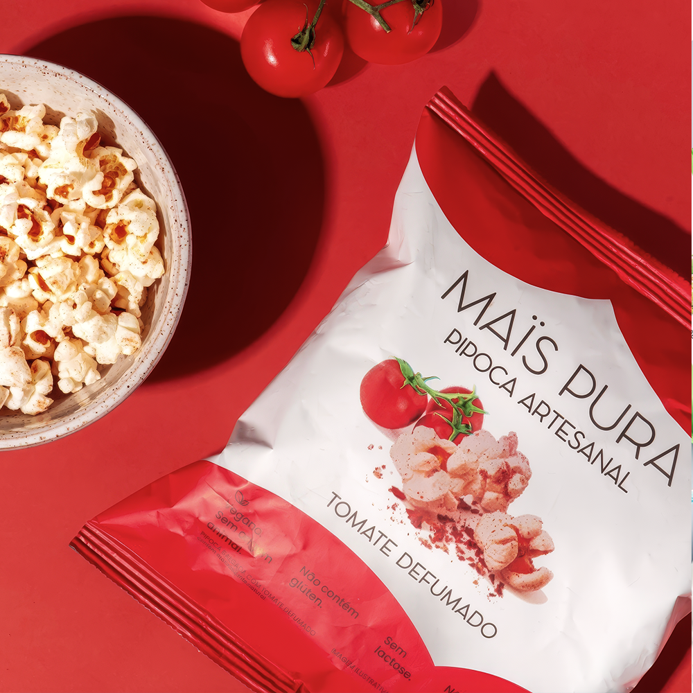
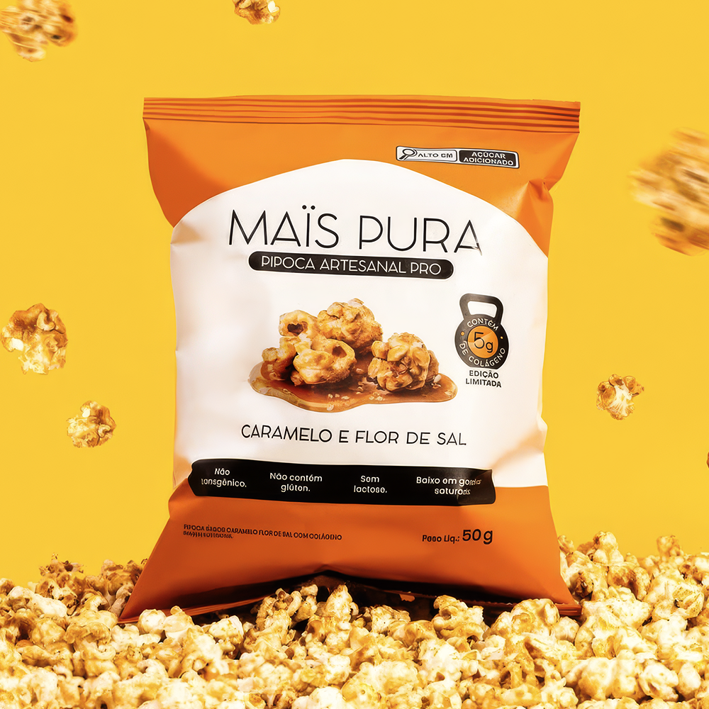
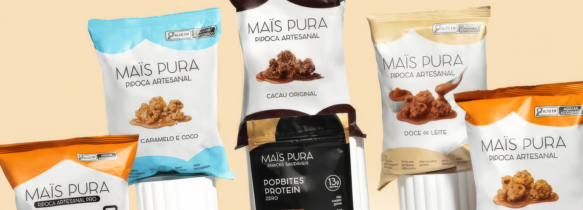
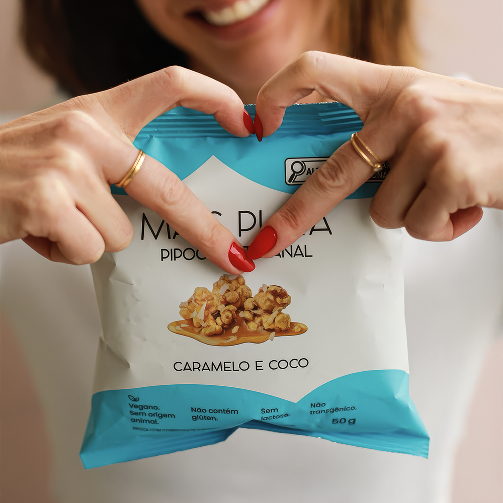
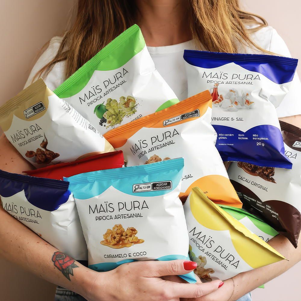
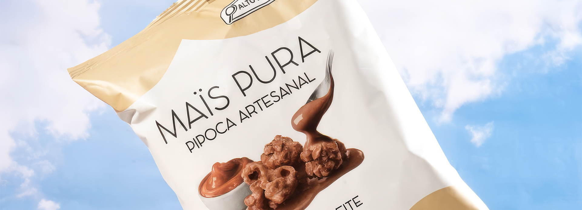
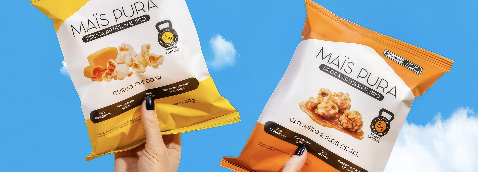
MAISPURA redefines the artisanal popcorn category with a minimalist, premium design. Its visual architecture highlights the ingredients, clearly organizes information, and uses color to differentiate flavors, thereby elevating the perception of quality and strengthening the brand at the point of sale.
The point of intersection between communication and art
MAISPURA
MAISPURA was created to transform popcorn into a premium, healthy, and desirable snack. The project’s challenge was to break away from the category’s traditional visual codes often cluttered with excessive graphics and build a contemporary identity that highlights ingredient quality, flavor sophistication, and brand transparency.
The design employs a minimalist aesthetic featuring ample white space, elegant typography, and a clean layout that places the product at the heart of the communication. Each flavor is identified by a consistent color-coding system, creating a scalable visual family that is instantly recognizable at the point of sale. The carefully crafted imagery highlights the indulgent nature of the ingredients while maintaining the perception of a natural, artisanal product.
Nutritional information and functional attributes are organized within a clear hierarchy, ensuring readability and building trust. The result is packaging that elevates the category’s perceived value, differentiates the brand on the shelf, and instantly communicates MAISPURA’s positioning: an artisanal popcorn that combines pleasure, quality, and well-being into a sophisticated visual experience.