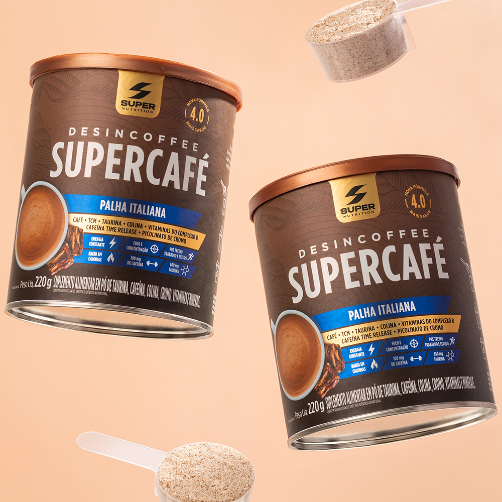
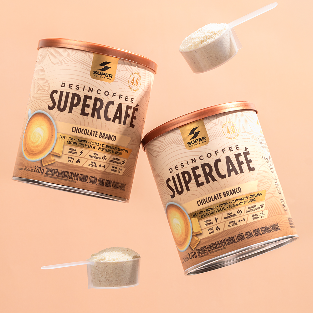
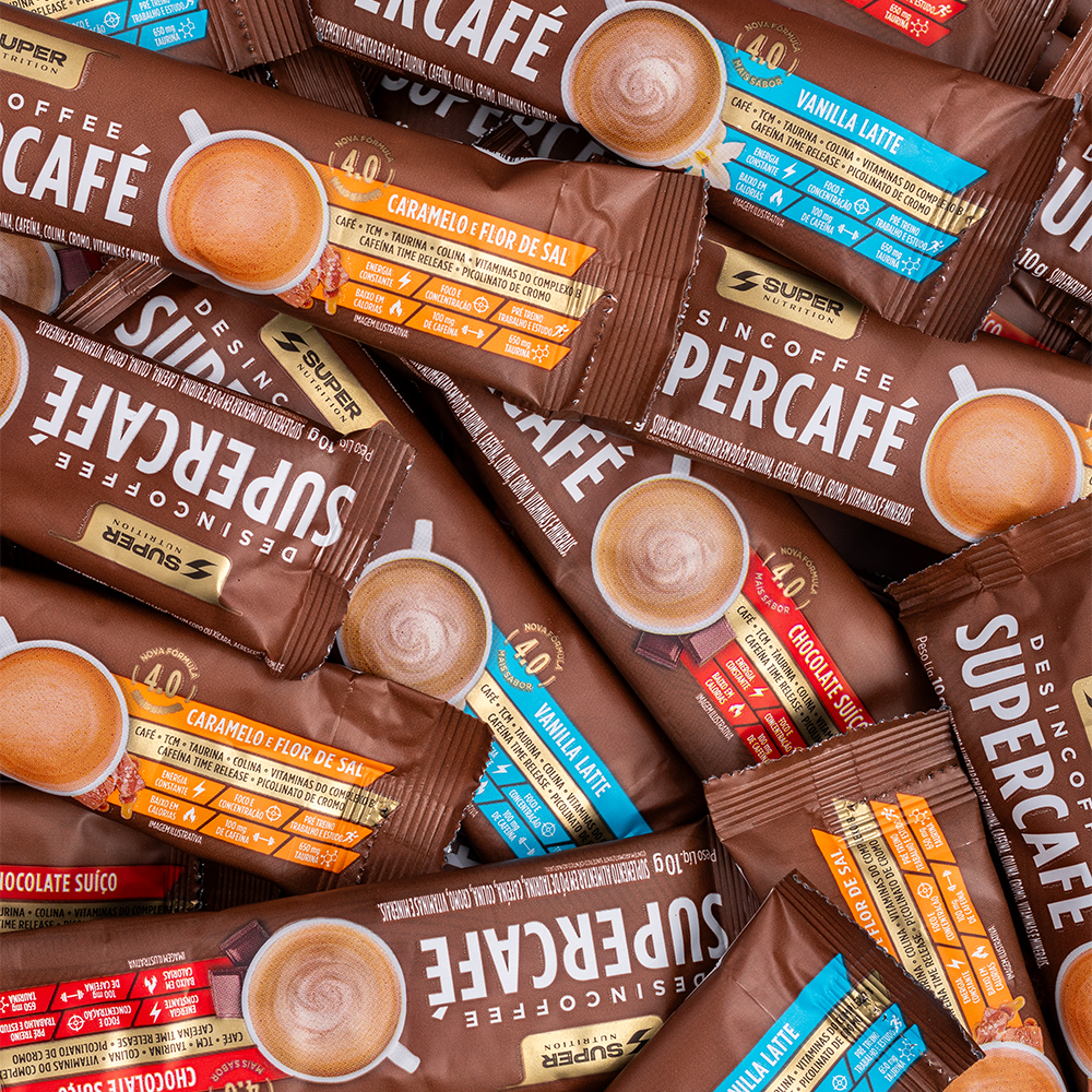
The design repositions SUPERCAFÉ by blending performance and indulgence. Inspired by the world of specialty coffee shops, it combines striking colors, clear visual architecture, and strong sensory appeal to convey energy, flavor, and premium quality, making the brand stand out at the point of sale.
The point of intersection between communication and art
SUPERCAFÉ
The project stemmed from the challenge of transforming a functional supplement into a consumer experience that combines performance, flavor, and desire. In a category defined by technical cues, the design sought to align the product with the world of specialty coffee shops, creating a more engaging, sophisticated, and premium visual identity without compromising nutritional credibility.
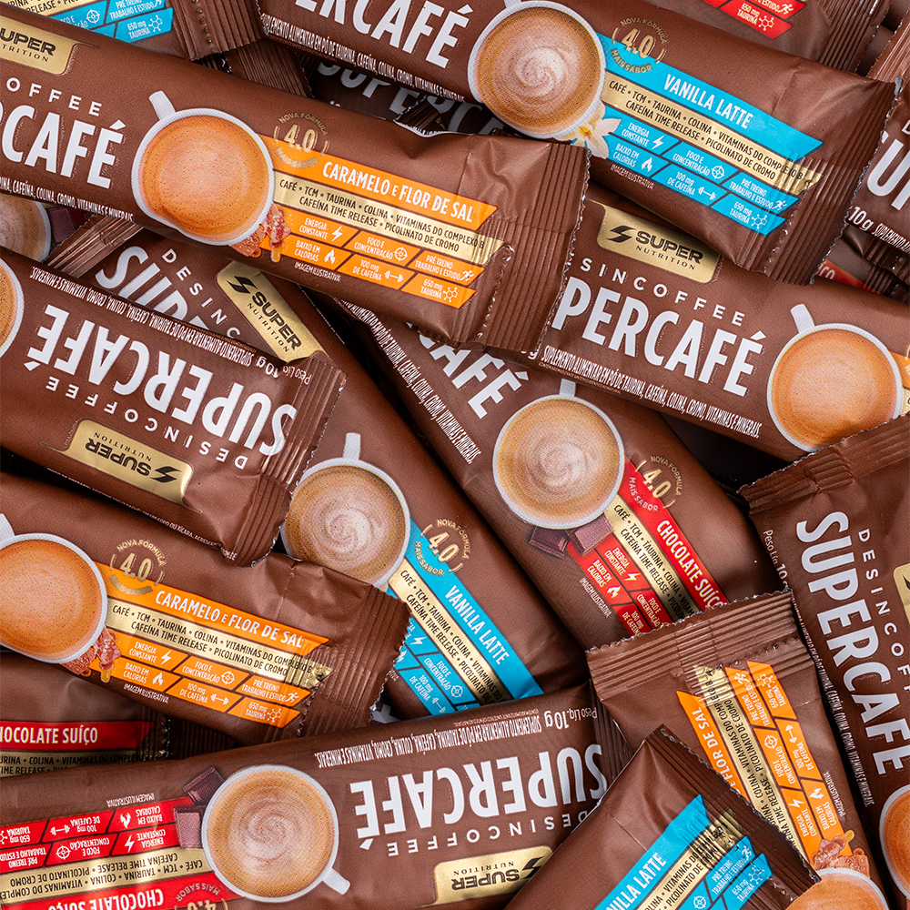
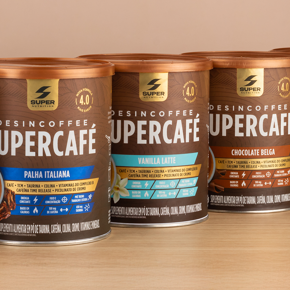
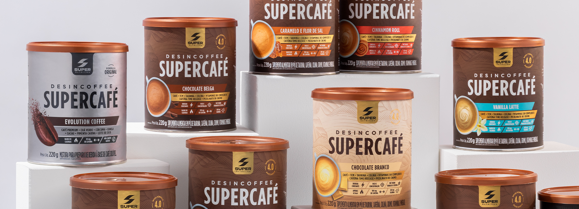
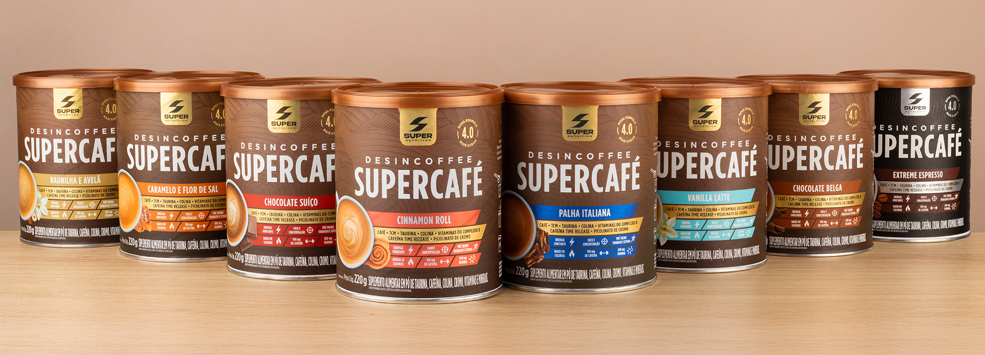
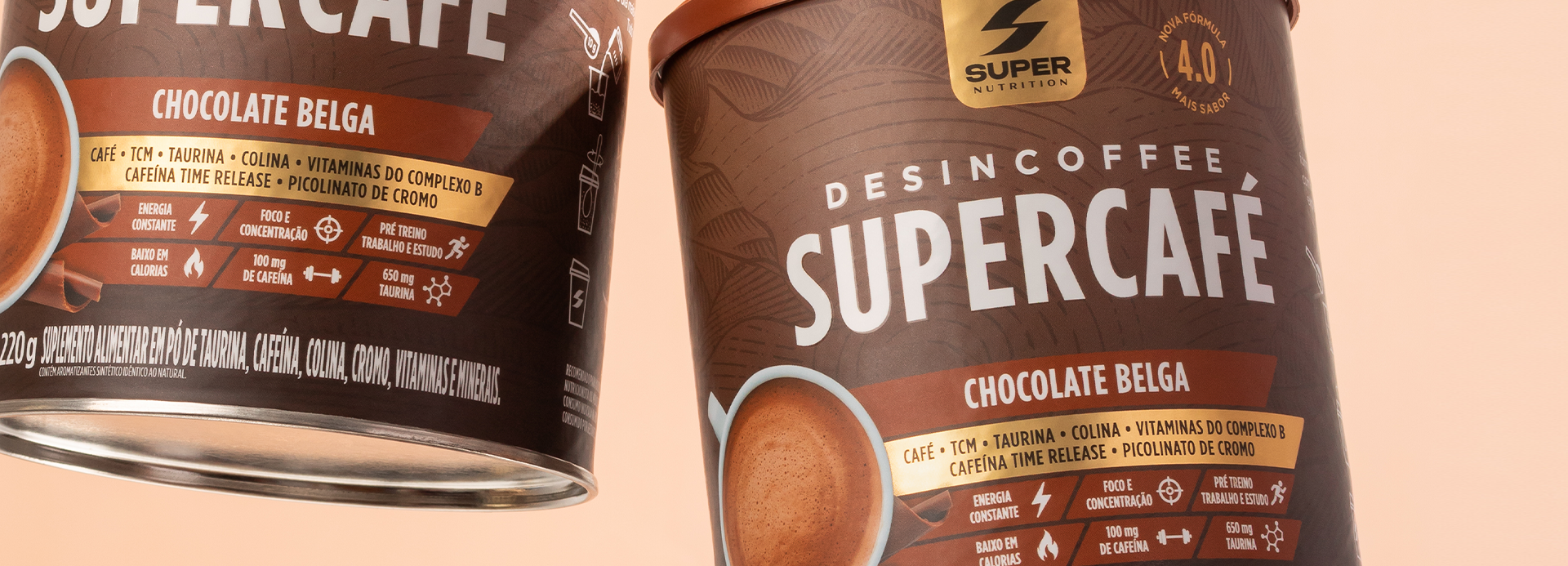
The graphic language blends rich coffee tones and gold with vibrant accent colors to differentiate flavors, establishing an intuitive visual architecture that makes a strong impact at the point of sale. Photography of the beverages and ingredients, alongside bean inspired graphic elements, reinforces a sense of indulgence while instantly evoking the qualities of aroma, creaminess, and excellence.
Information hierarchy was restructured to quickly communicate key functional benefits energy, focus, and performance balancing technical attributes with an emotional aesthetic. The color system facilitates flavor identification and strengthens brand recognition, ensuring consistency across various packaging formats.
More than just a redesign, the project repositions SUPERCAFÉ as a brand that delivers performance without sacrificing the sensory experience. The result is a contemporary, premium, and highly memorable identity capable of turning a supplement into a pleasurable ritual, thereby elevating its perceived value and expanding its market relevance.